Welcome
to my Portfolio
for Falmouth University Illustration BA (Hons) online
This page brings together a selection of my drawings, visual experiments, and creative projects as I prepare to begin Illustration BA (Hons) (online) at Falmouth University. My work is rooted in storytelling, observation, atmosphere, and character, with an interest in how images can carry emotion, memory, and meaning. This portfolio presents both finished pieces and developing ideas, reflecting the visual language and creative process I am continuing to shape.
Let`s take a look
Exhibition pieces for Art Expo Graz in 2026
At ART EXPO Graz, I exhibited two of my illustrations, including, for the first time, larger-format work at 50 x 70 cm. It was a valuable experience to see my work presented alongside a wide range of contemporary fine art, much of it abstract and materially very different from my own. This contrast helped me reflect more clearly on the direction I want to pursue: while I value the visual presence of an artwork in itself, I am increasingly drawn to illustration because of its stronger relationship to narrative, meaning and communication.
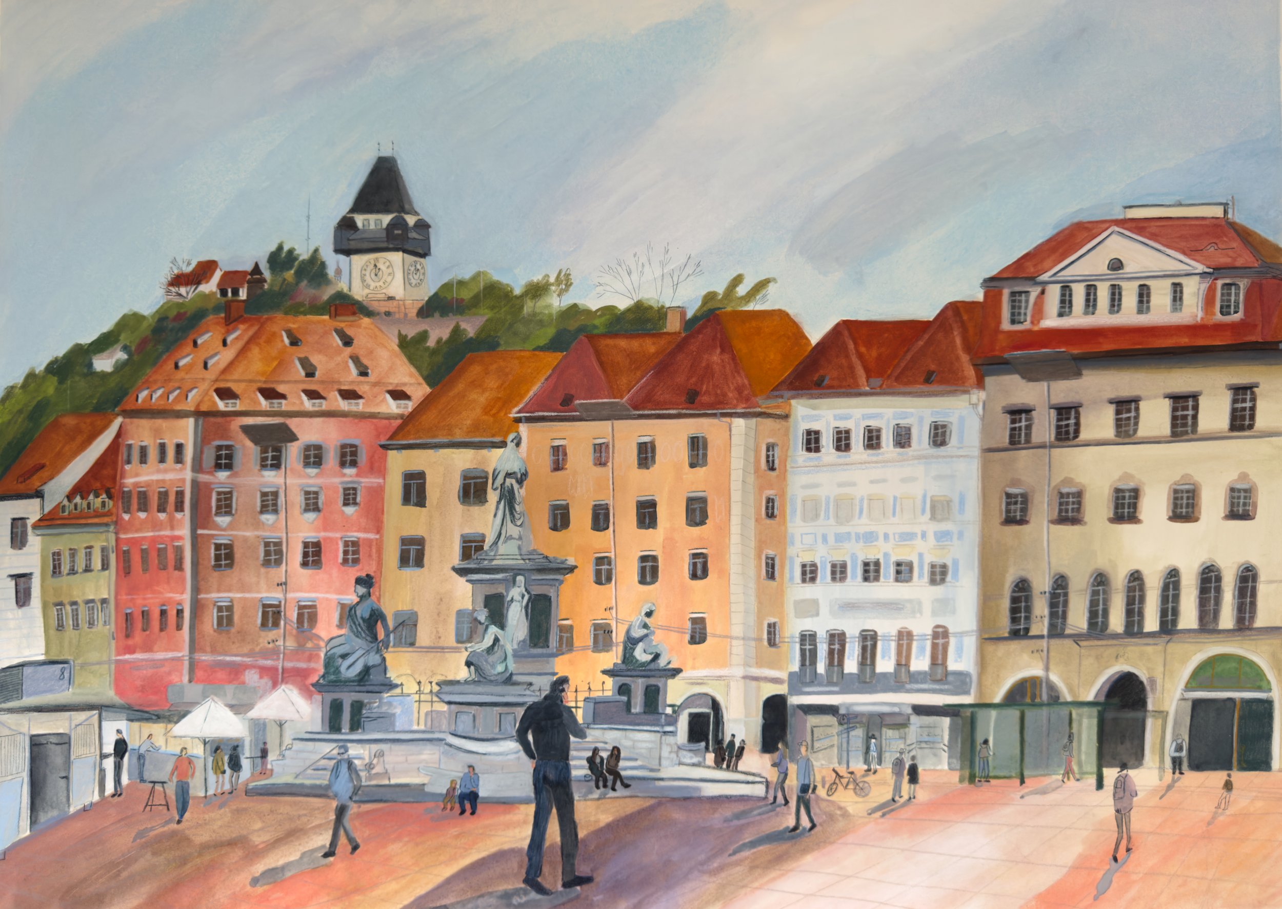
Rooftops and Footsteps, 2026, Art Expo Graz, 50×70 cm
observational painting using mixed media e.g. gouache, watercolor, ink, pencils, pastels
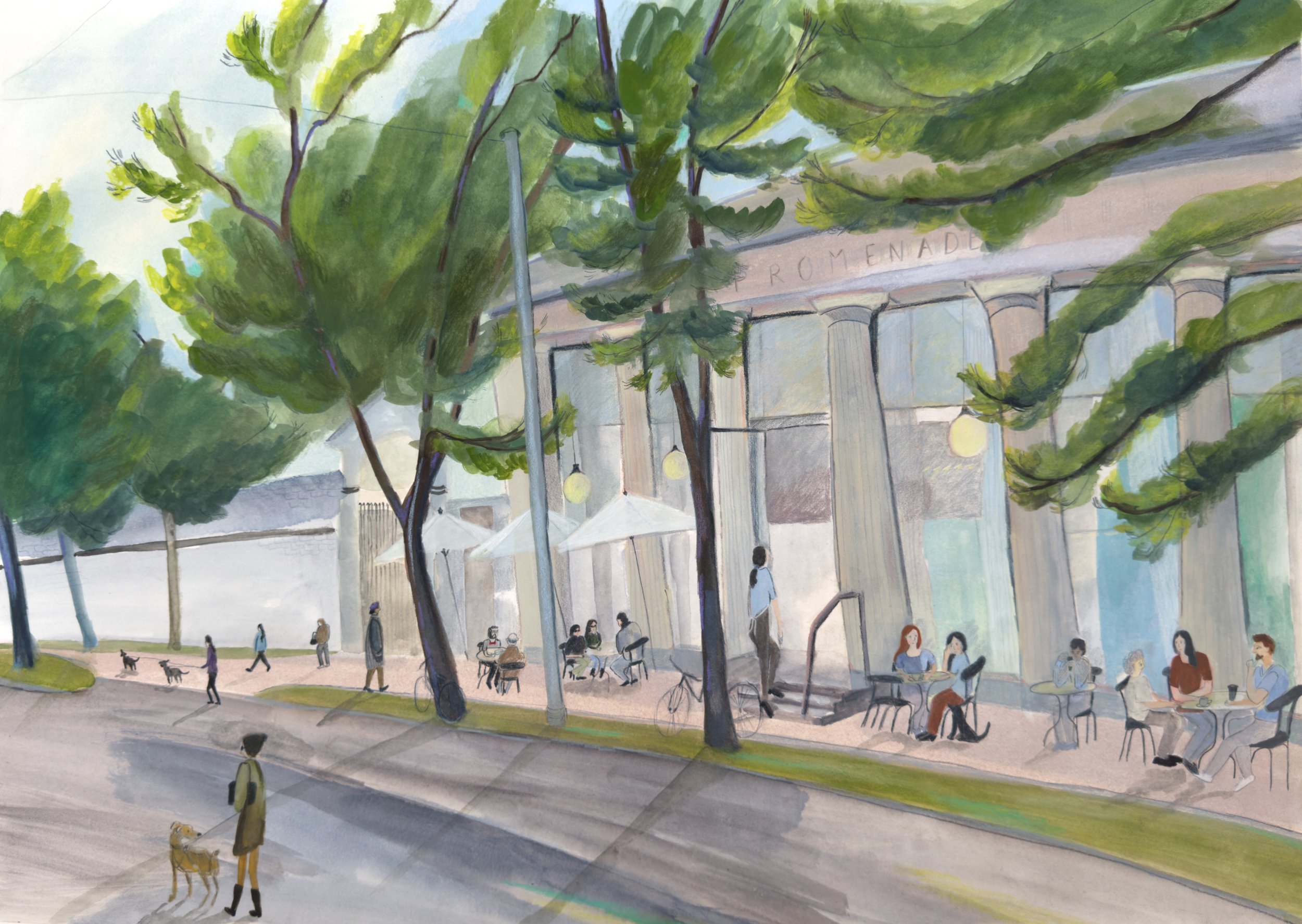
Café Promenade, 2026, Art Expo Graz, 50×70 cm
observational painting using mixed media e.g. gouache, watercolor, ink, pencils, pastels
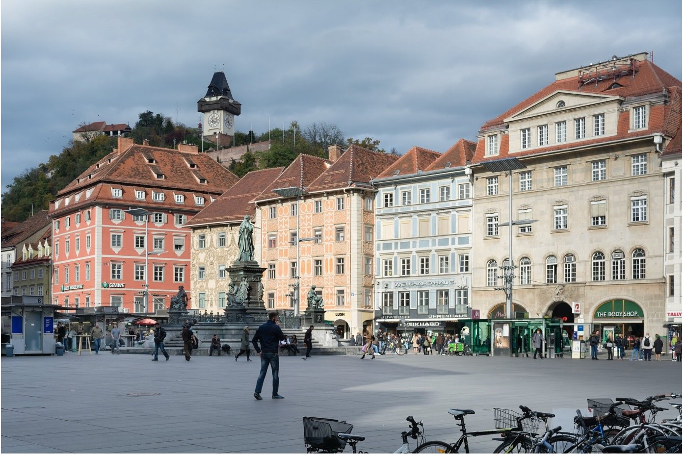
This observational painting began with time spent in Graz Main Square, where I was interested in translating the atmosphere of the city, its architecture and the movement of people into image.
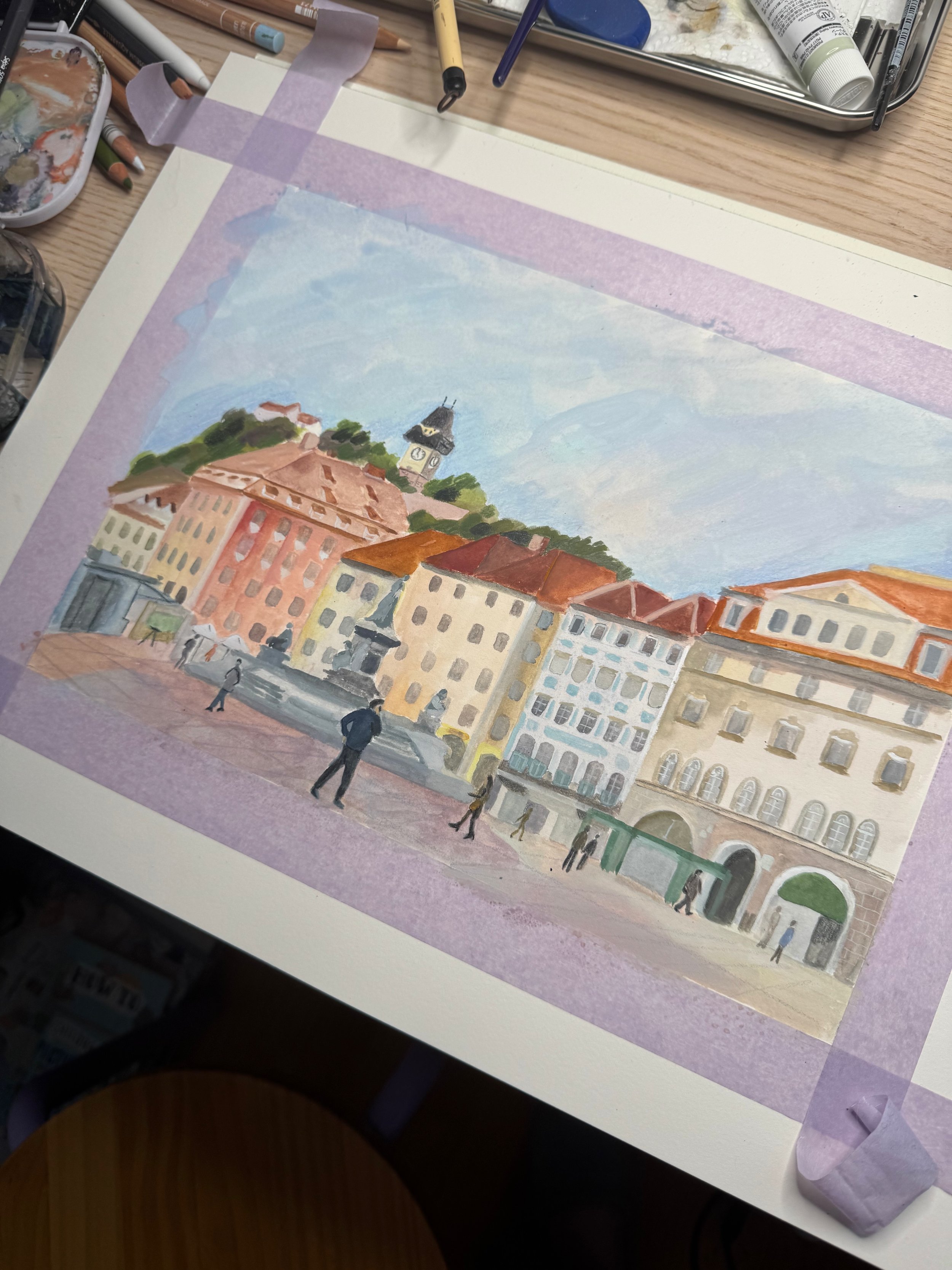
I first developed the scene in a smaller format of 23 x 31 cm, which allowed me to explore composition, colour relationships and the balance between structure and openness.
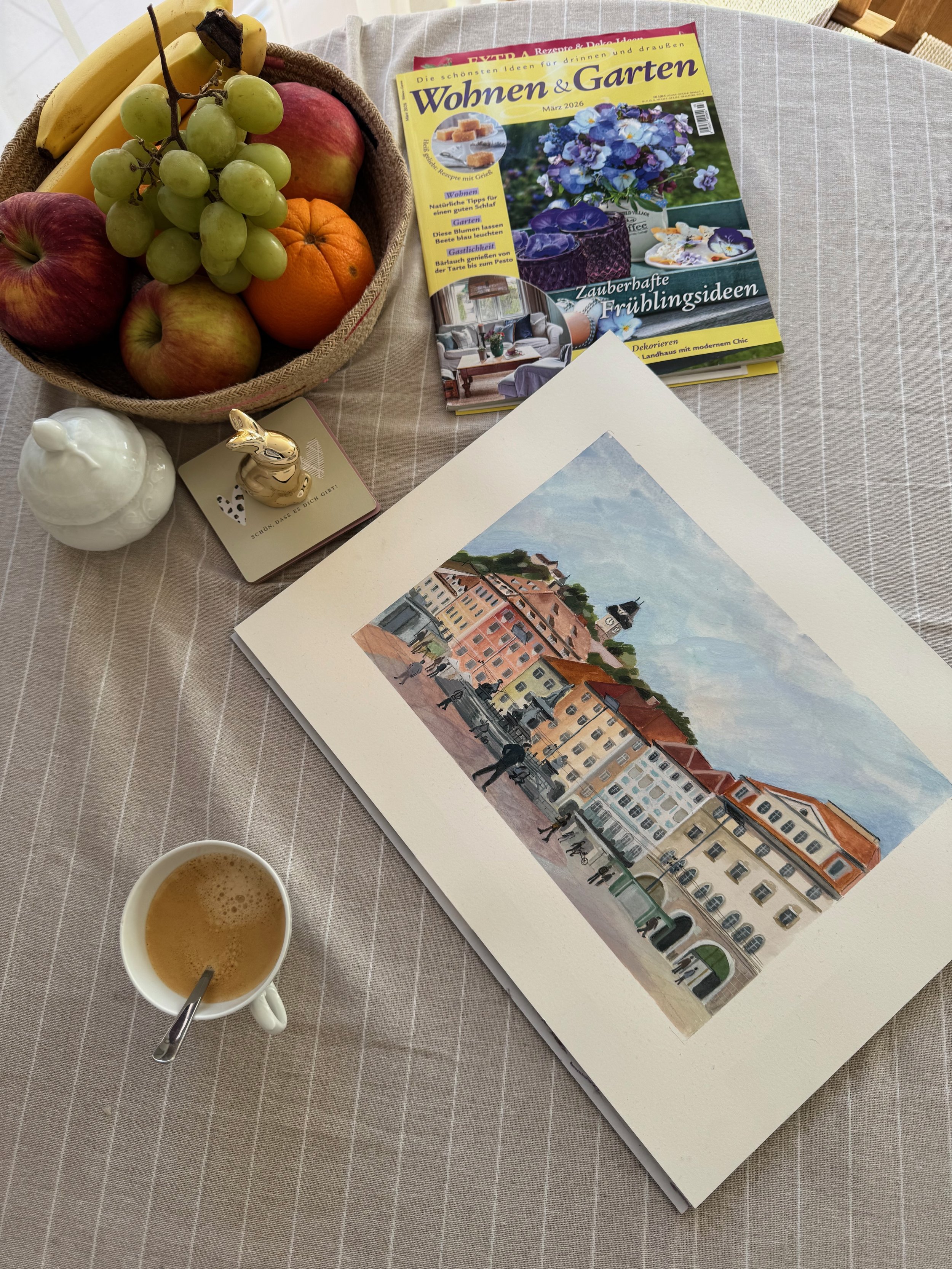
Later, I returned to the same image on a larger scale of 50 x 70 cm, which gave me the opportunity to expand its spatial presence and rethink how the scene could function more fully as an illustration.
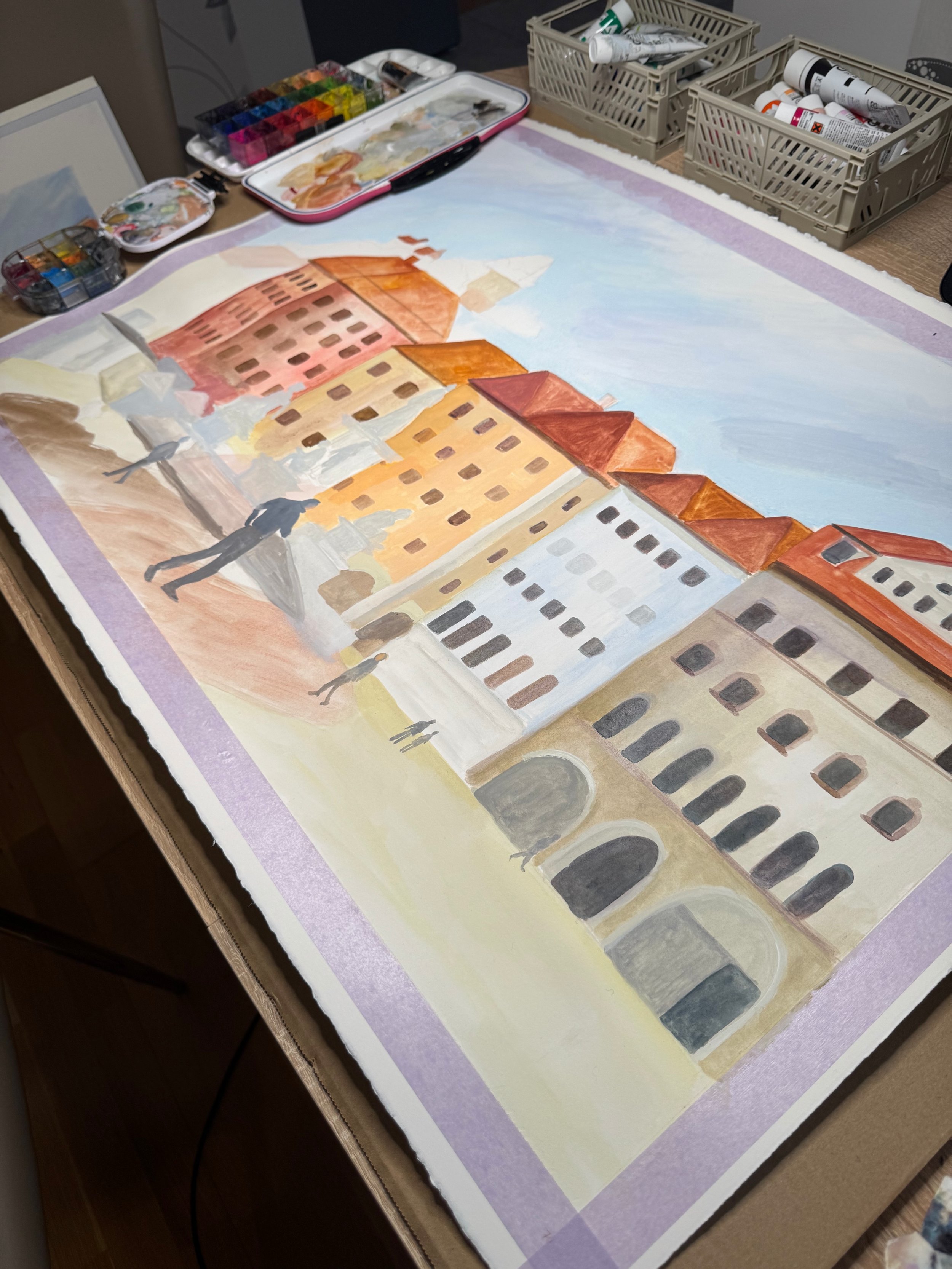
The work was created using a mixed-media combination of gouache, watercolour, soft pastel and pencil.
Visual Storytelling
I participated in a visual storytelling challenge organised by Venster Academy on Instagram, which encouraged me to think beyond individual drawings and begin working in story form. I created a narrative inspired by everyday life, using observation as a starting point while shaping it into a more illustrative sequence. I used the four prompts ( curiosity, collision, illuminate and narrow escape) as an opportunity to experiment with different visual styles, colours and materials, trying approaches I would not normally choose. This helped me explore how observation can develop into storytelling, and how shifts in medium and colour can shape atmosphere and meaning.
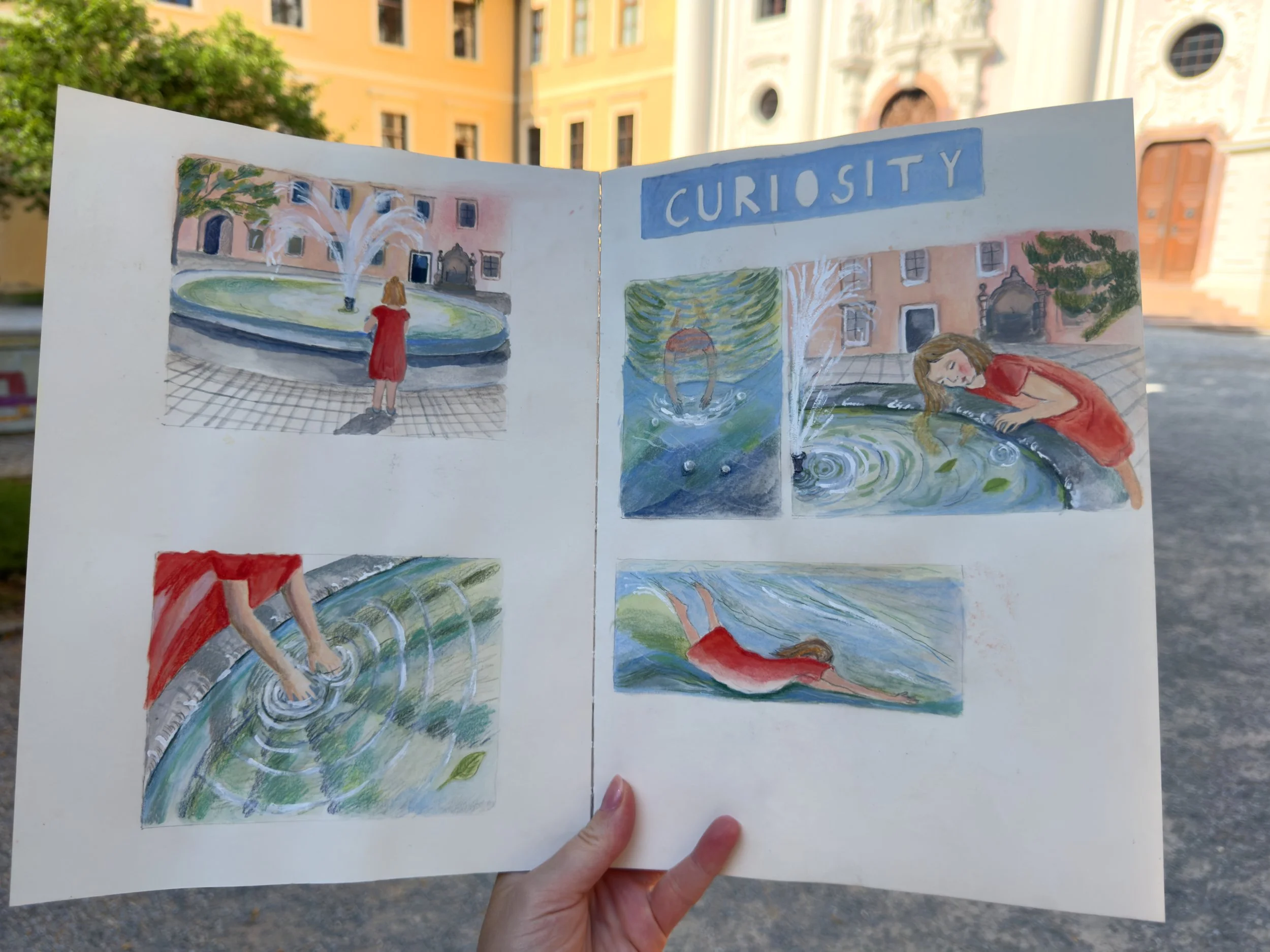
I created this project in my Pith Oroblanco Sketchbook, working throughout in mixed media. One of my aims was to experiment with new colour relationships, so each scene was approached with a slightly different palette and emotional atmosphere. The project grew directly out of everyday life. My daughter has a remarkable fascination with water, and her curiosity in encountering it has become the starting point for these images.
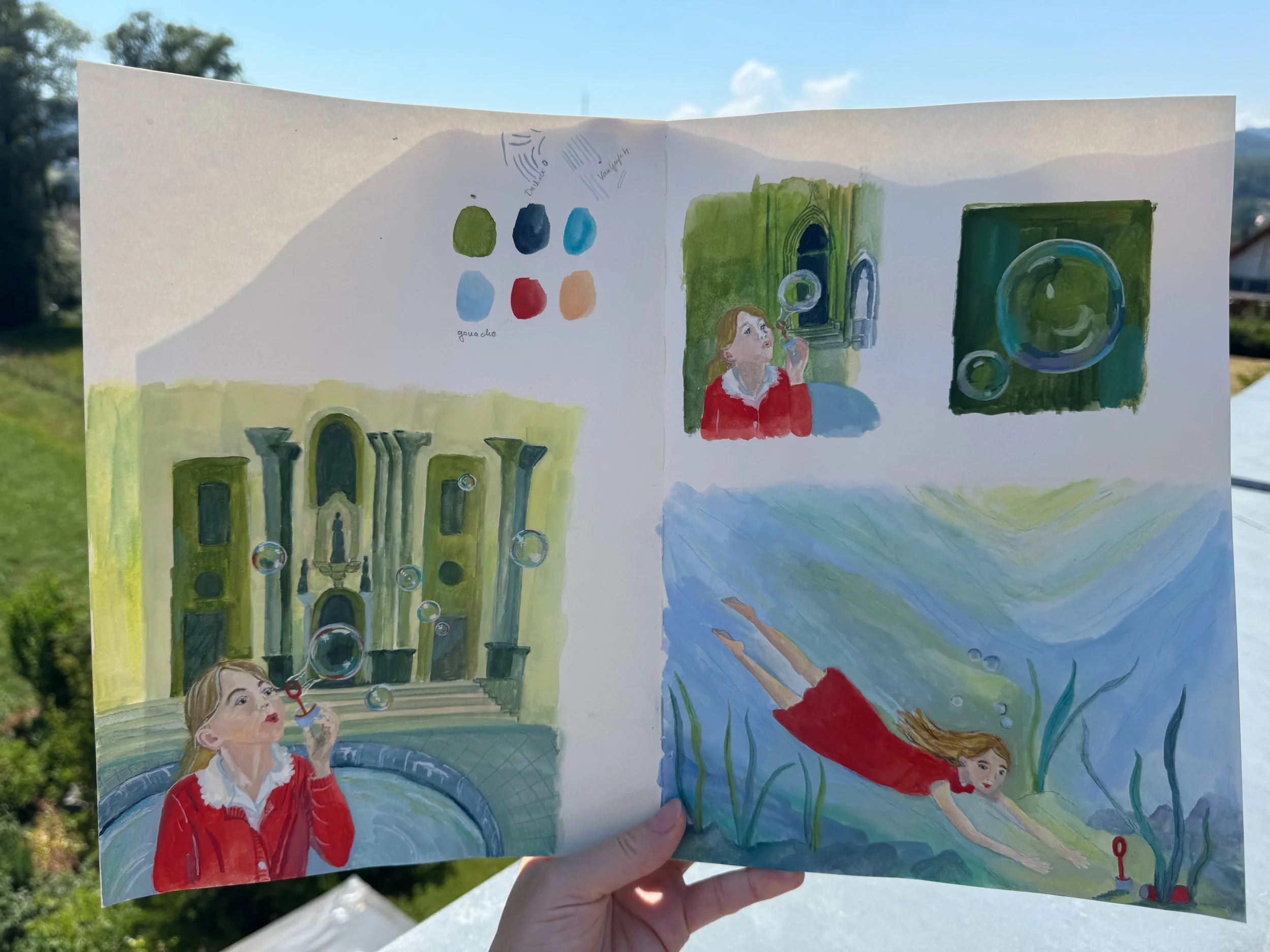
Each day on the way to kindergarten, we pass through an abbey founded in the twelfth century. In the centre of its courtyard there is a fountain, which changes with the seasons. This place became a small world of repeated observation and imagination. She blew bubbles there, watched the movement of water, touched the surface after rain, and transformed these ordinary encounters into something full of wonder.
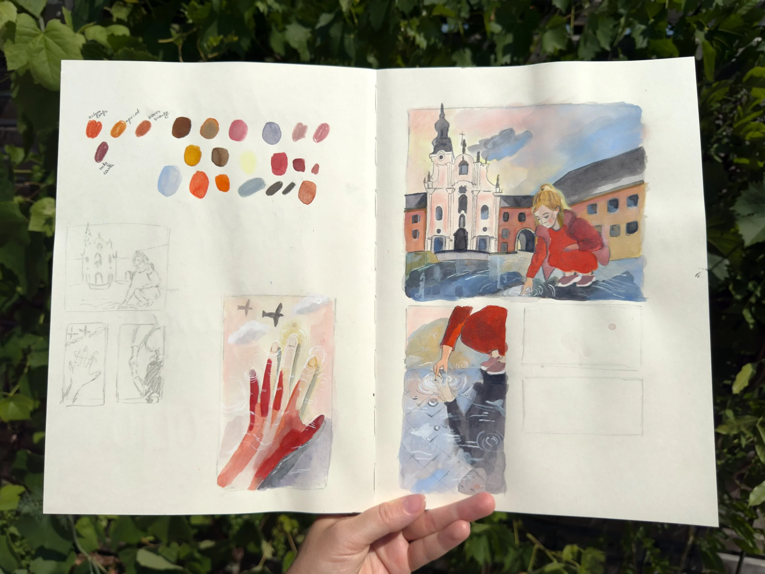
These sketchbook pages show part of the development process behind the project. I used them to test colour palettes, compositions and visual transitions between scenes. Because I wanted each image to carry a different emotional tone, these studies became an important way of thinking through how colour might shape narrative and atmosphere across the series.
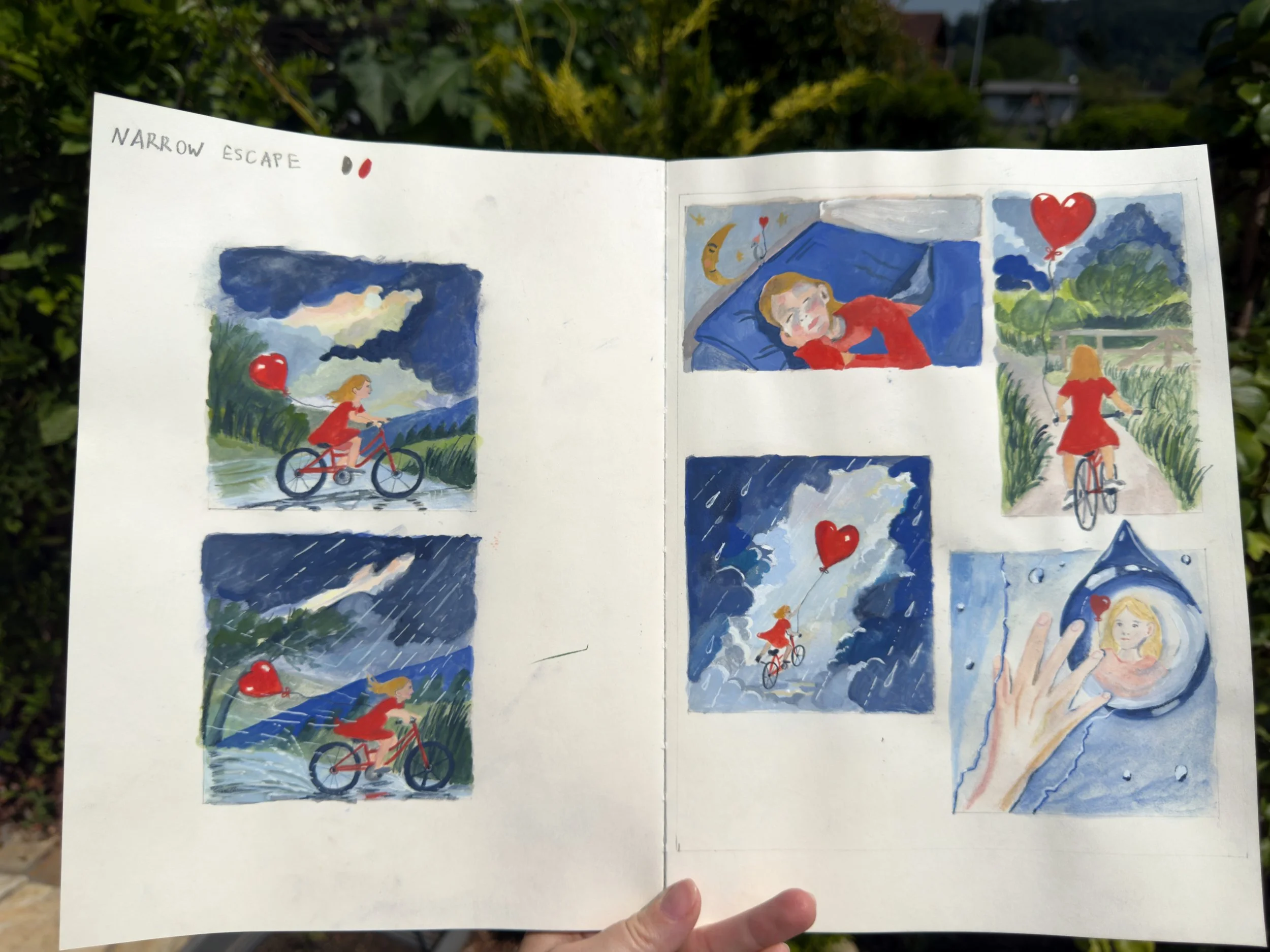
Through this project, I wanted to translate those moments into a visual sequence that moves between observation and imagination, while also exploring how colour, composition and mixed media can shape mood and narrative.
Small projects
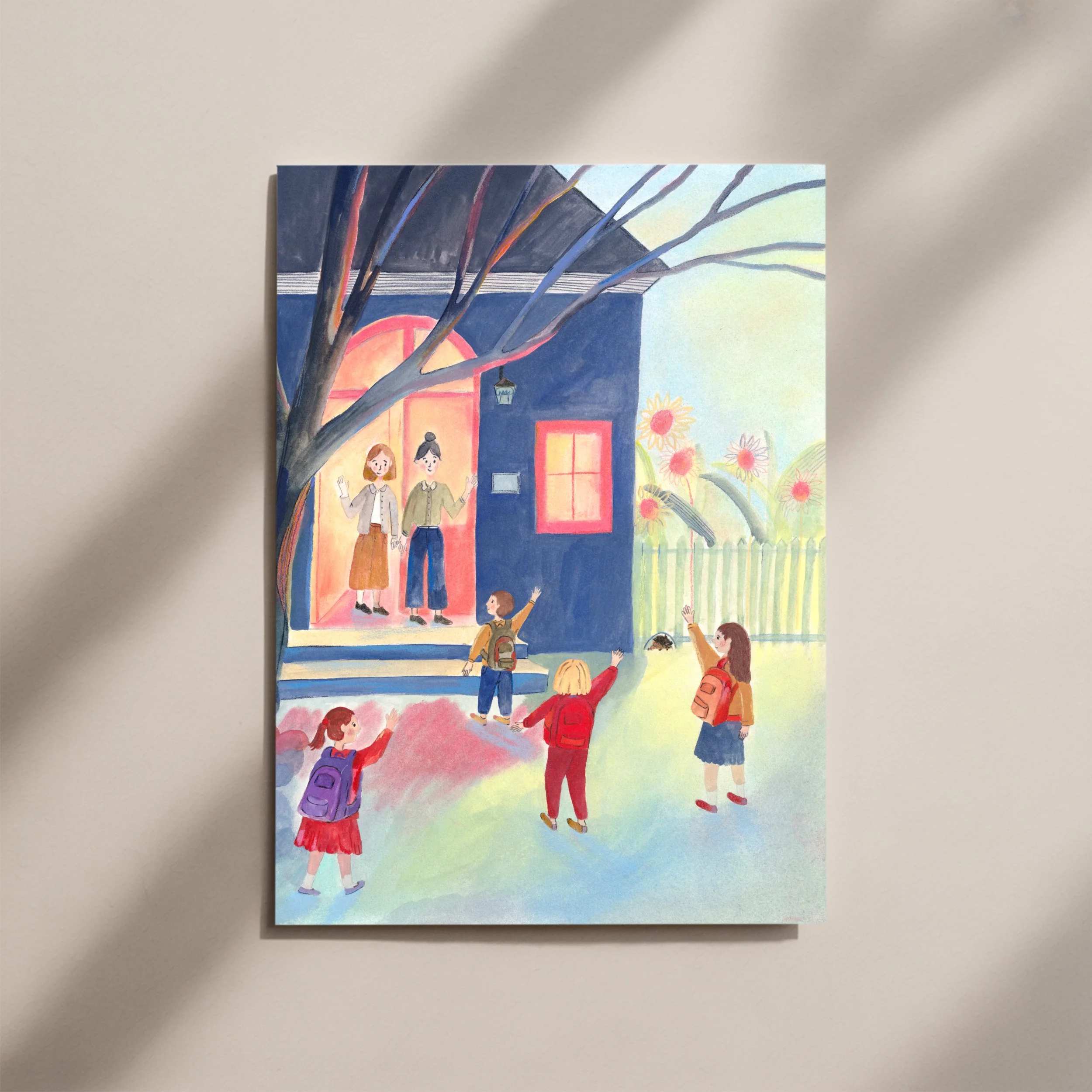
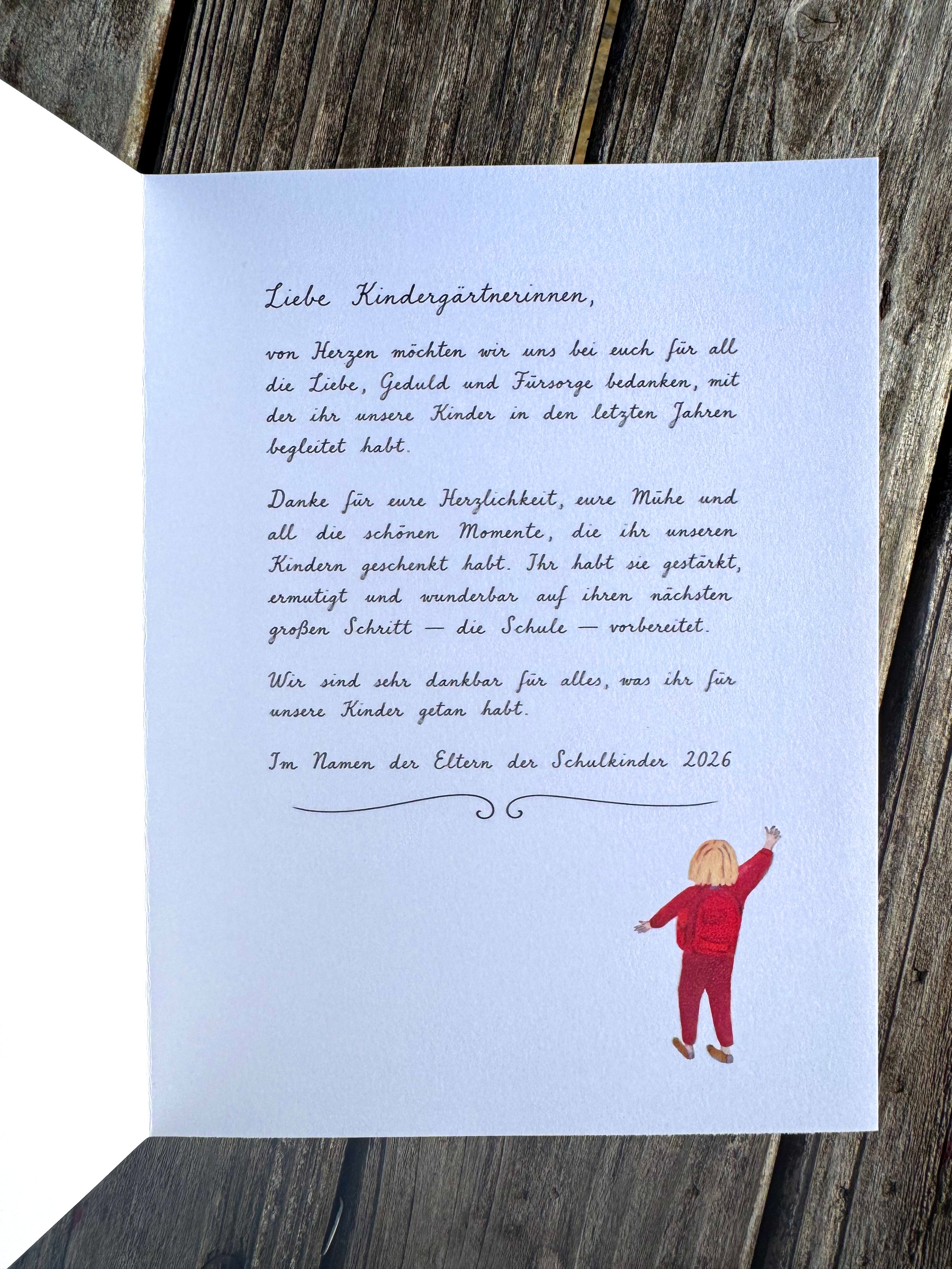
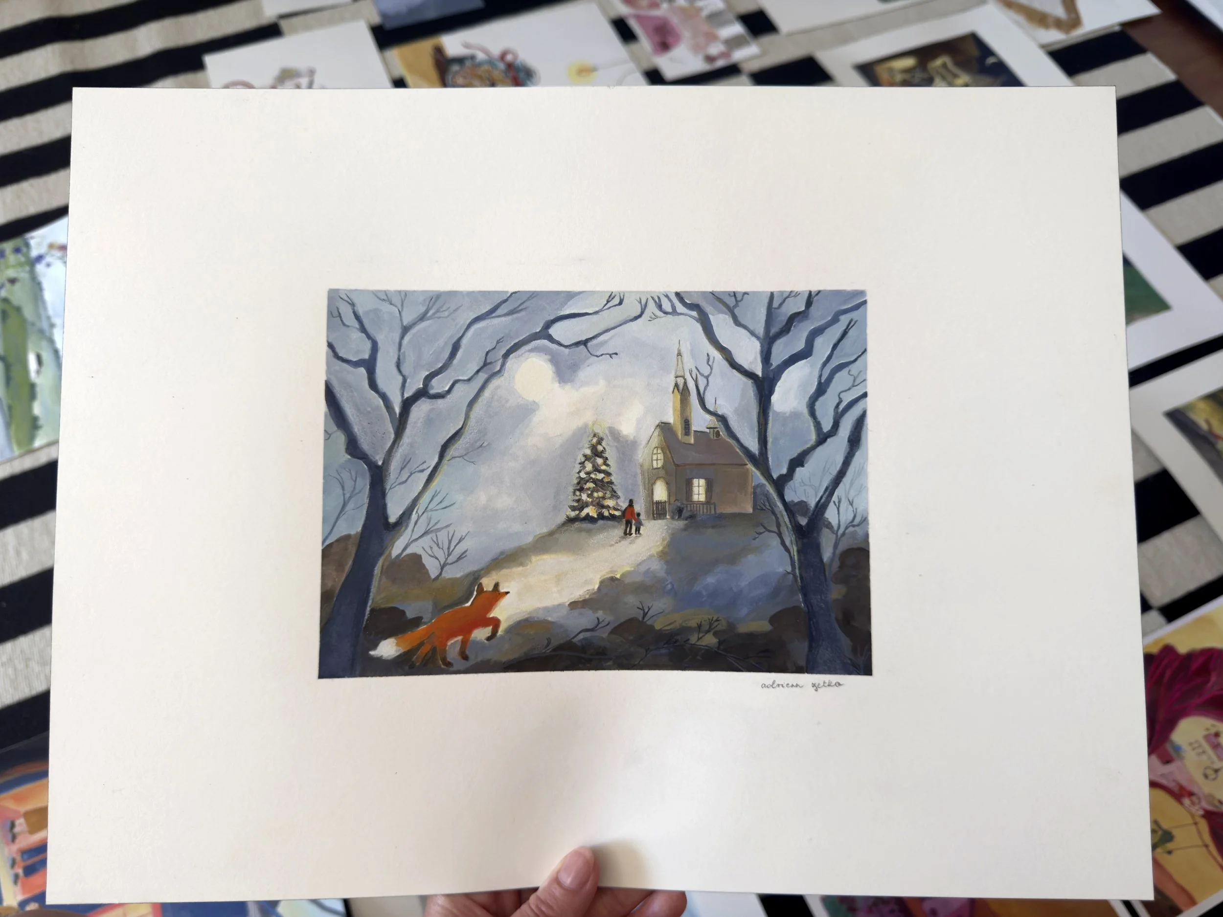
People began approaching me to create cards for different occasions, such as birthday invitations, Christmas cards and other event-based designs. Through this, I became more aware of how illustration can enter people’s lives in personal and meaningful ways. These cards also offered me a valuable small-scale way of testing public response to my work. They helped me see which images invited curiosity and connection, and how even small printed formats can still hold atmosphere, narrative and a clear visual identity.

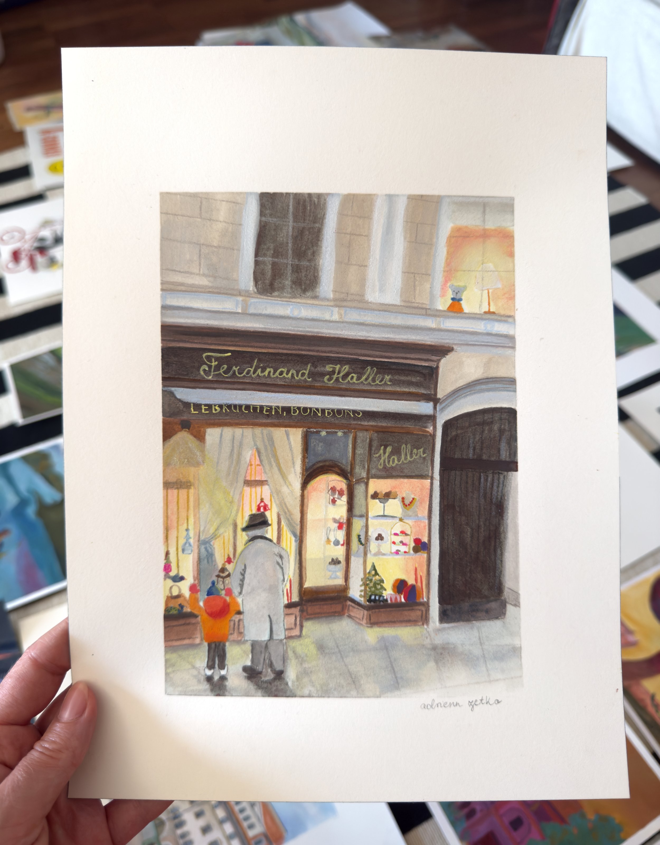
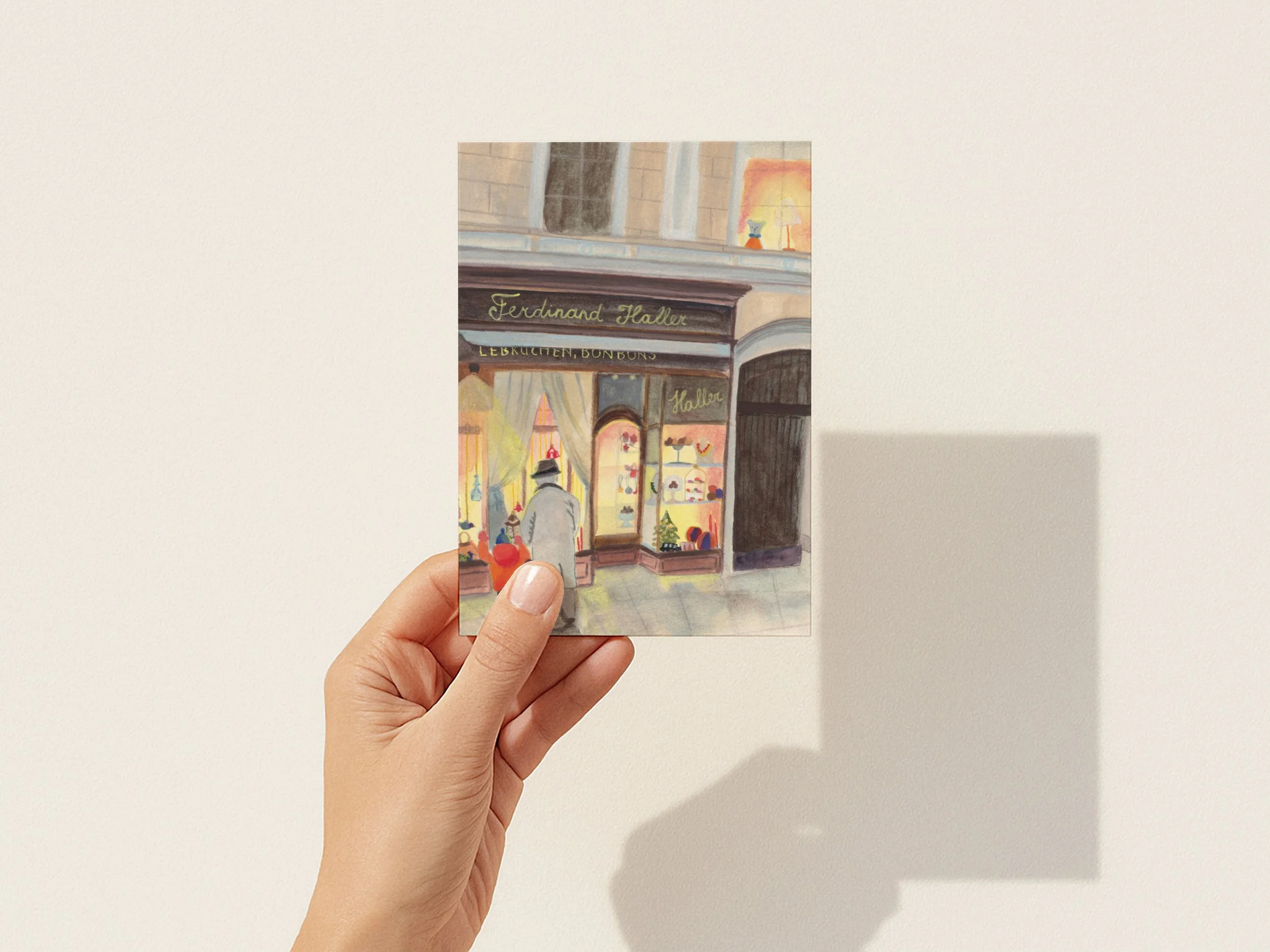
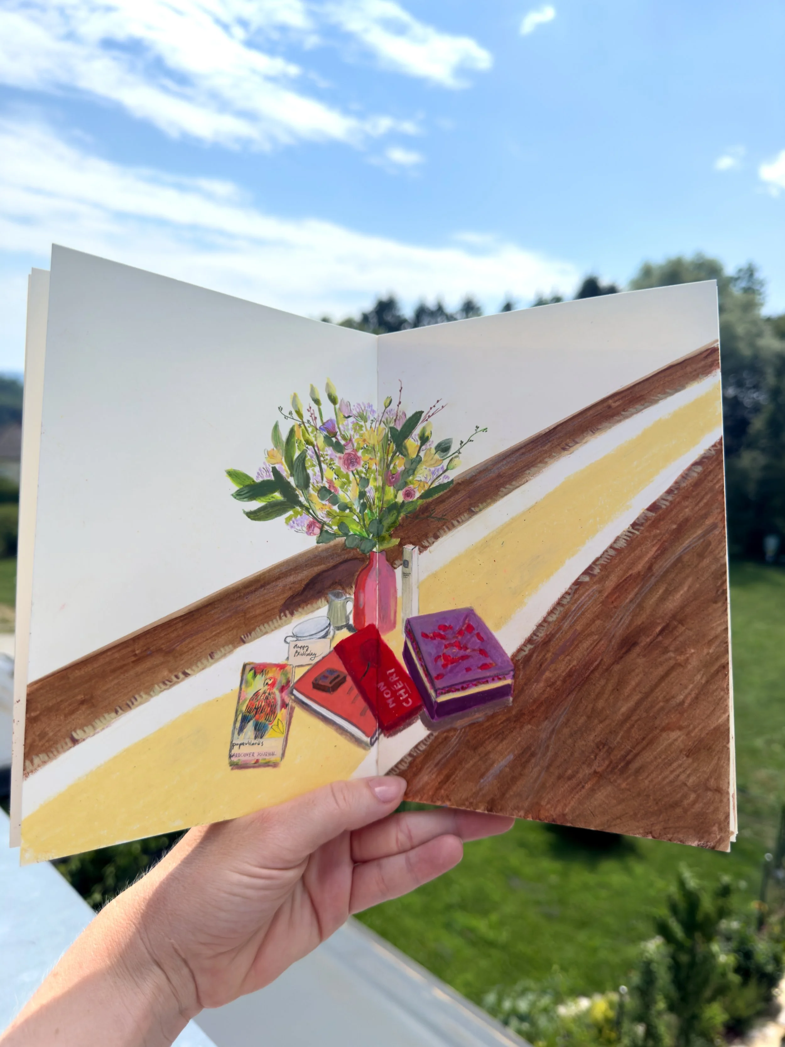
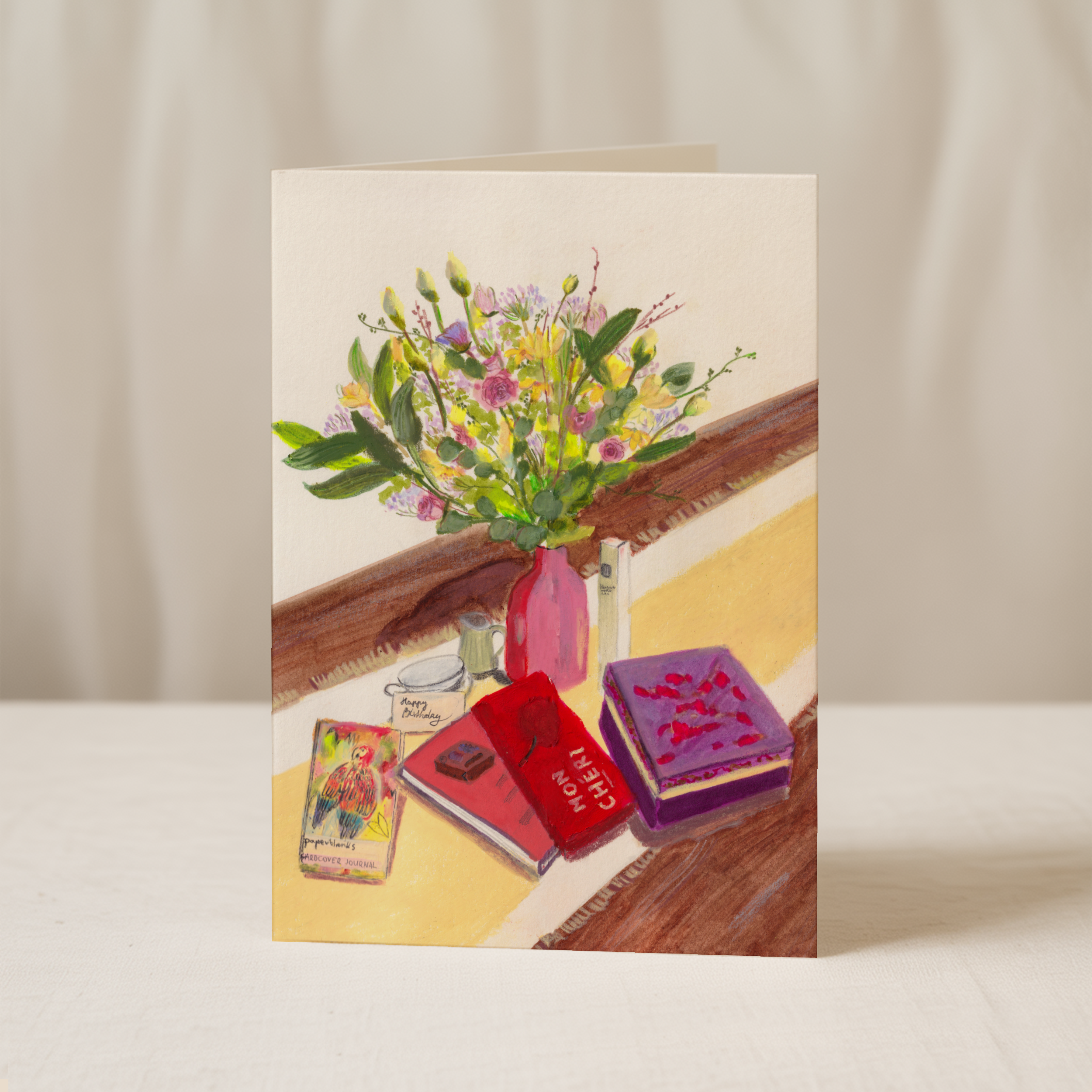
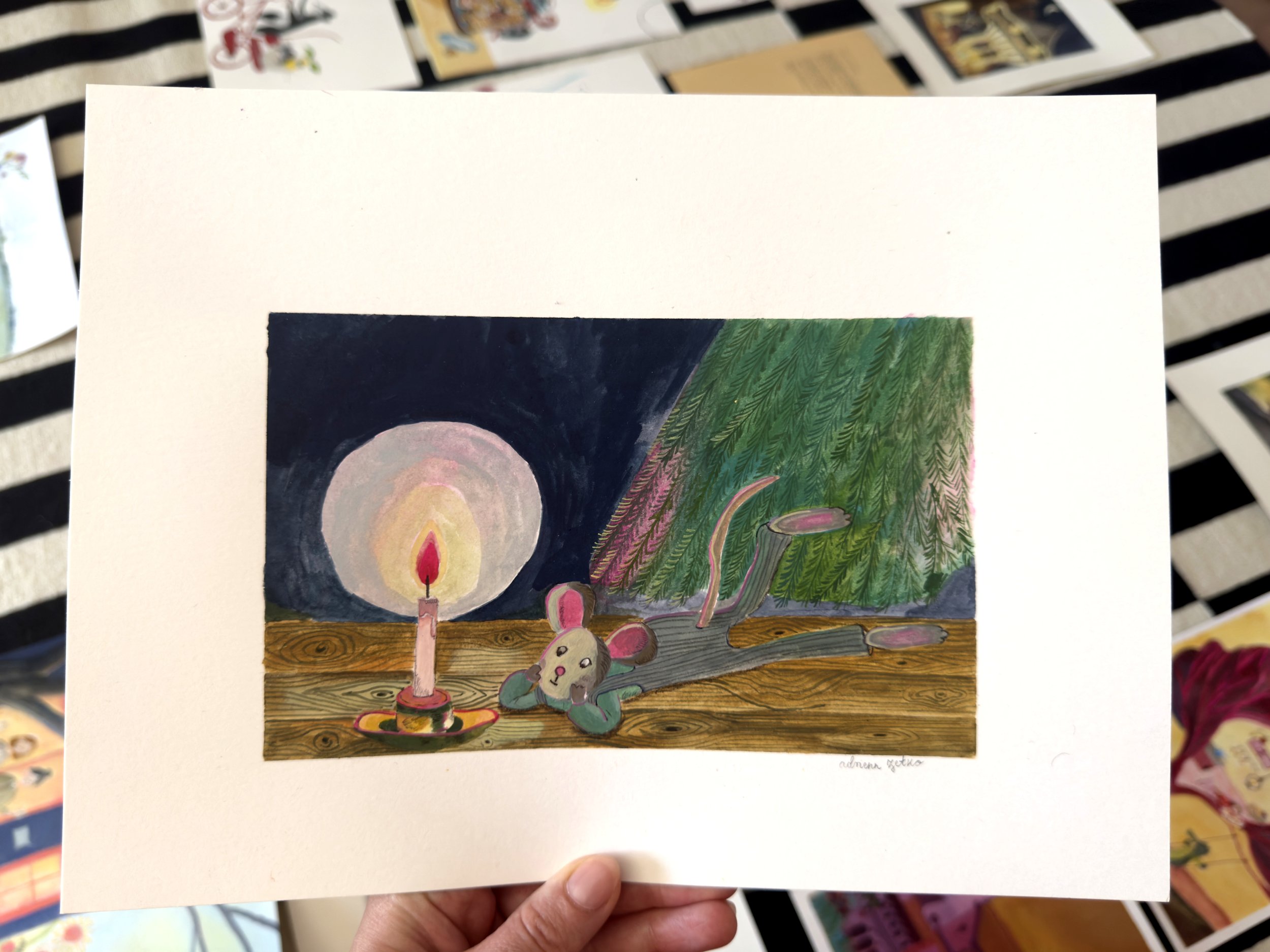
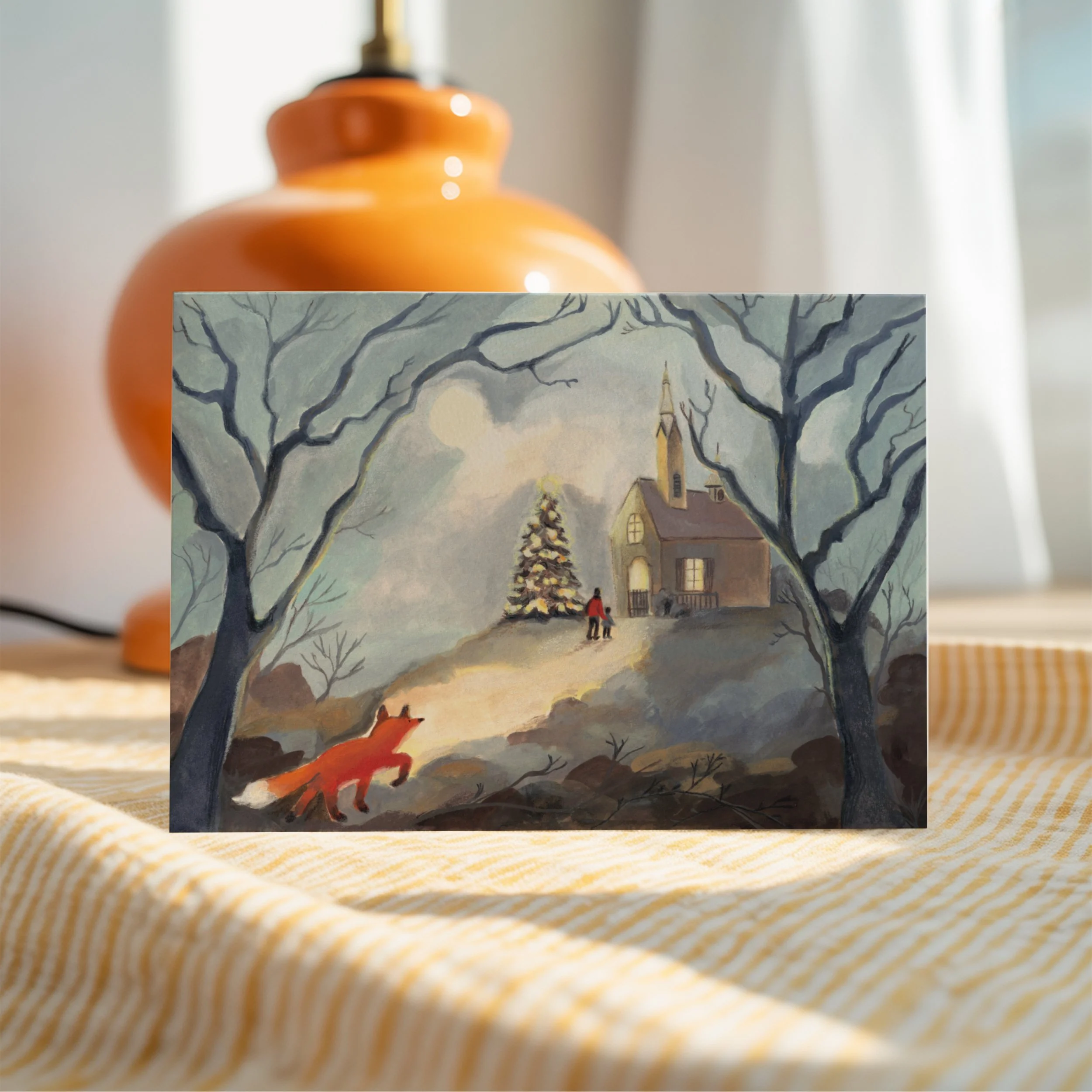
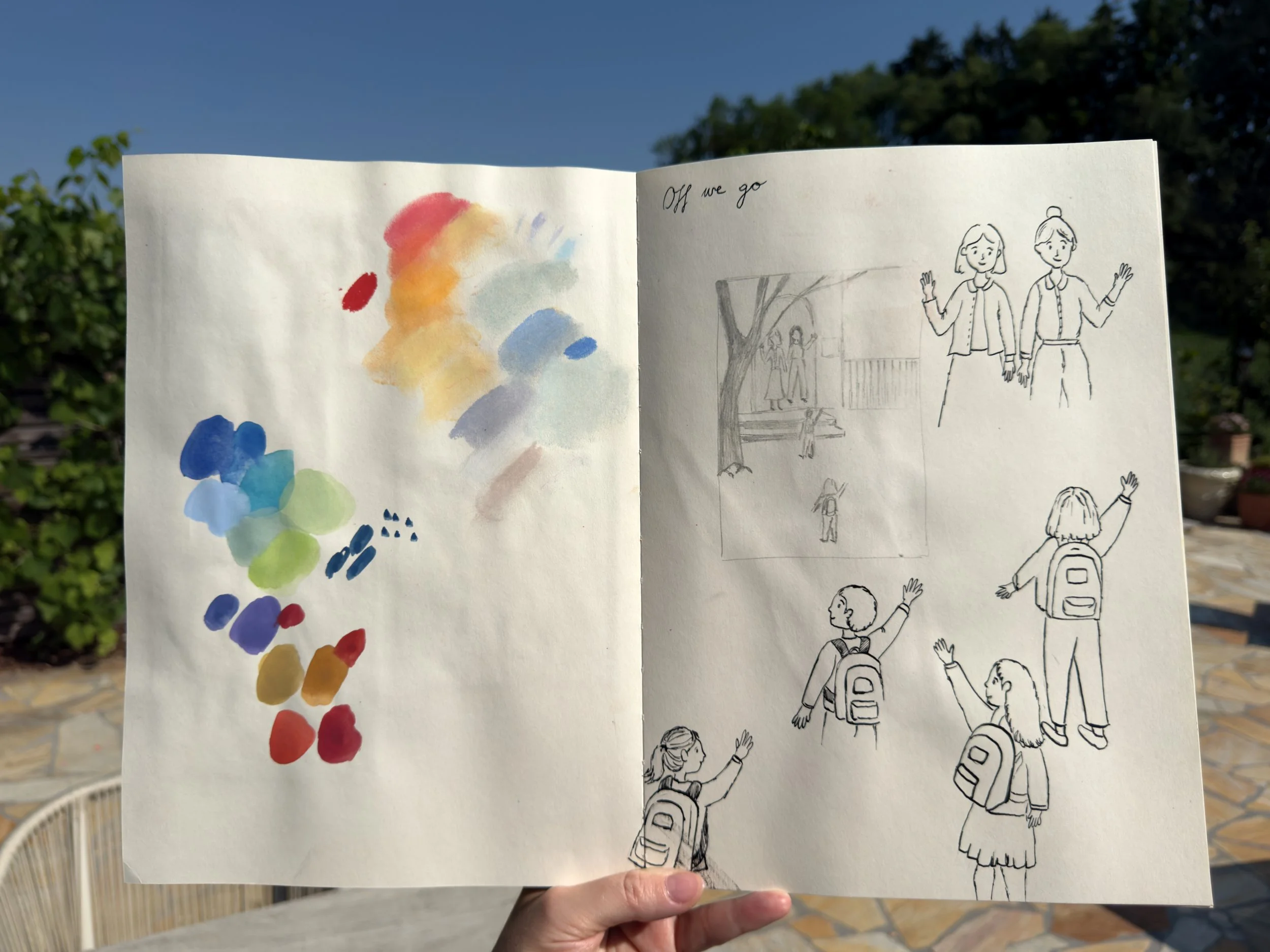
Pages from my Pith Sketchbook (Cara Cara), where I developed initial drawing ideas, explored colour relationships and gathered visual notes for a Christmas cards project. I use sketchbooks not only to record observations, but also to test combinations of materials, compositions and atmosphere before creating a final piece. These pages show that process of searching, collecting and shaping ideas.
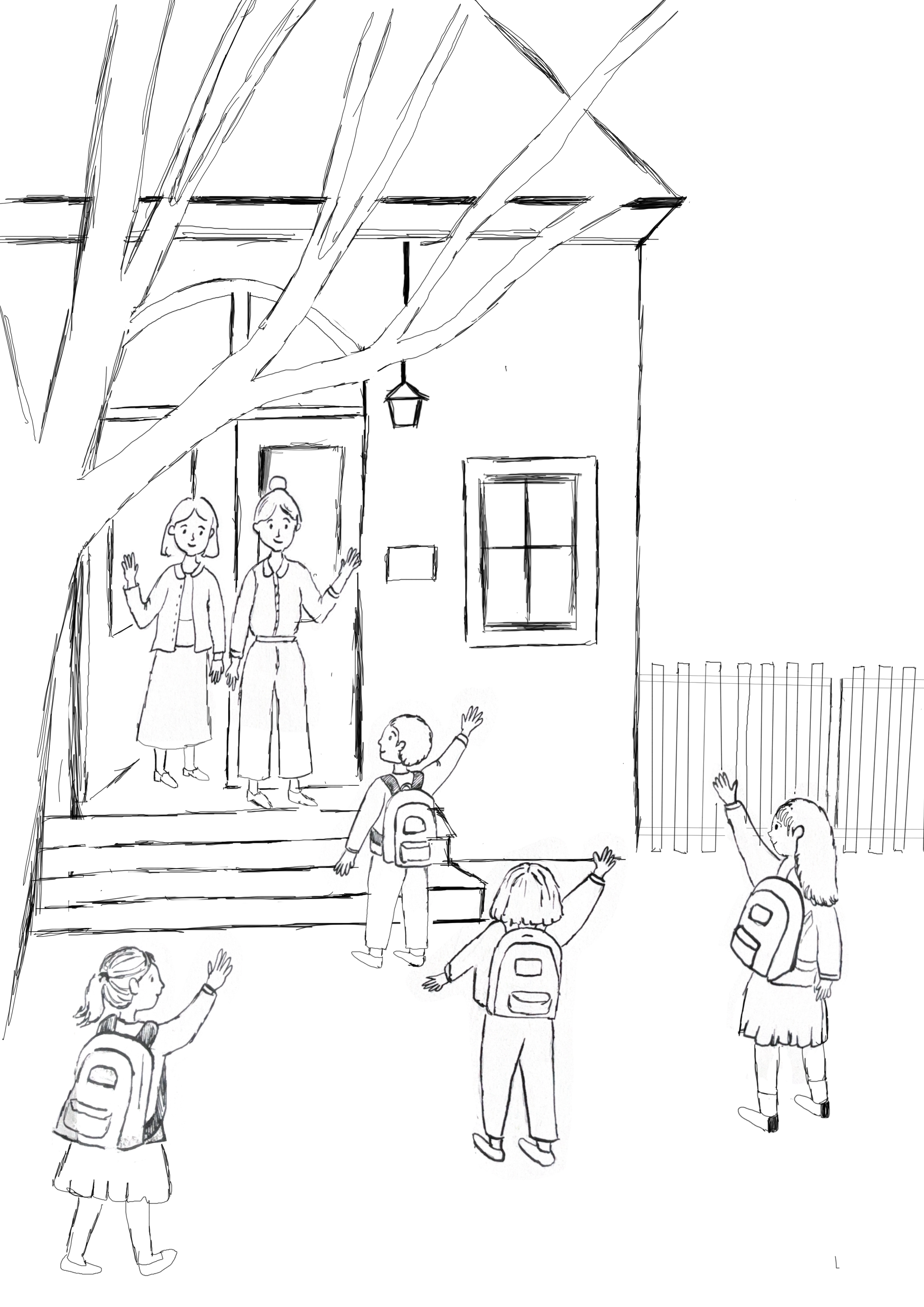
I then use Procreate to plan the full scene and test how the image might develop before creating the final painting in analogue media. When I want the piece to work as a printed object, I use Affinity and Procreate in the final stage.
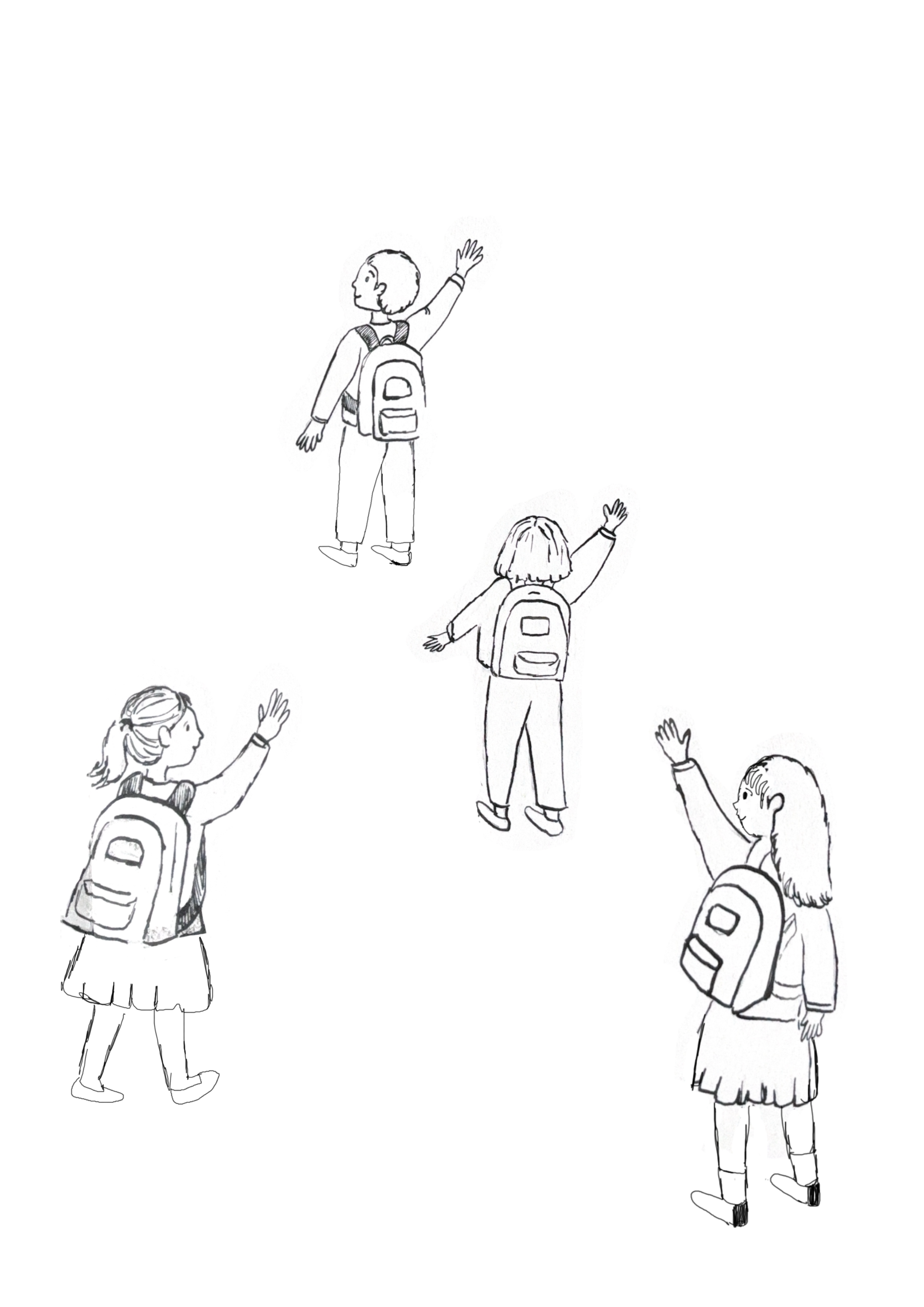
I make subtle digital additions and adjustments. In this way, I can keep the warmth and texture of the original painting while shaping it into a finished image suitable for print.
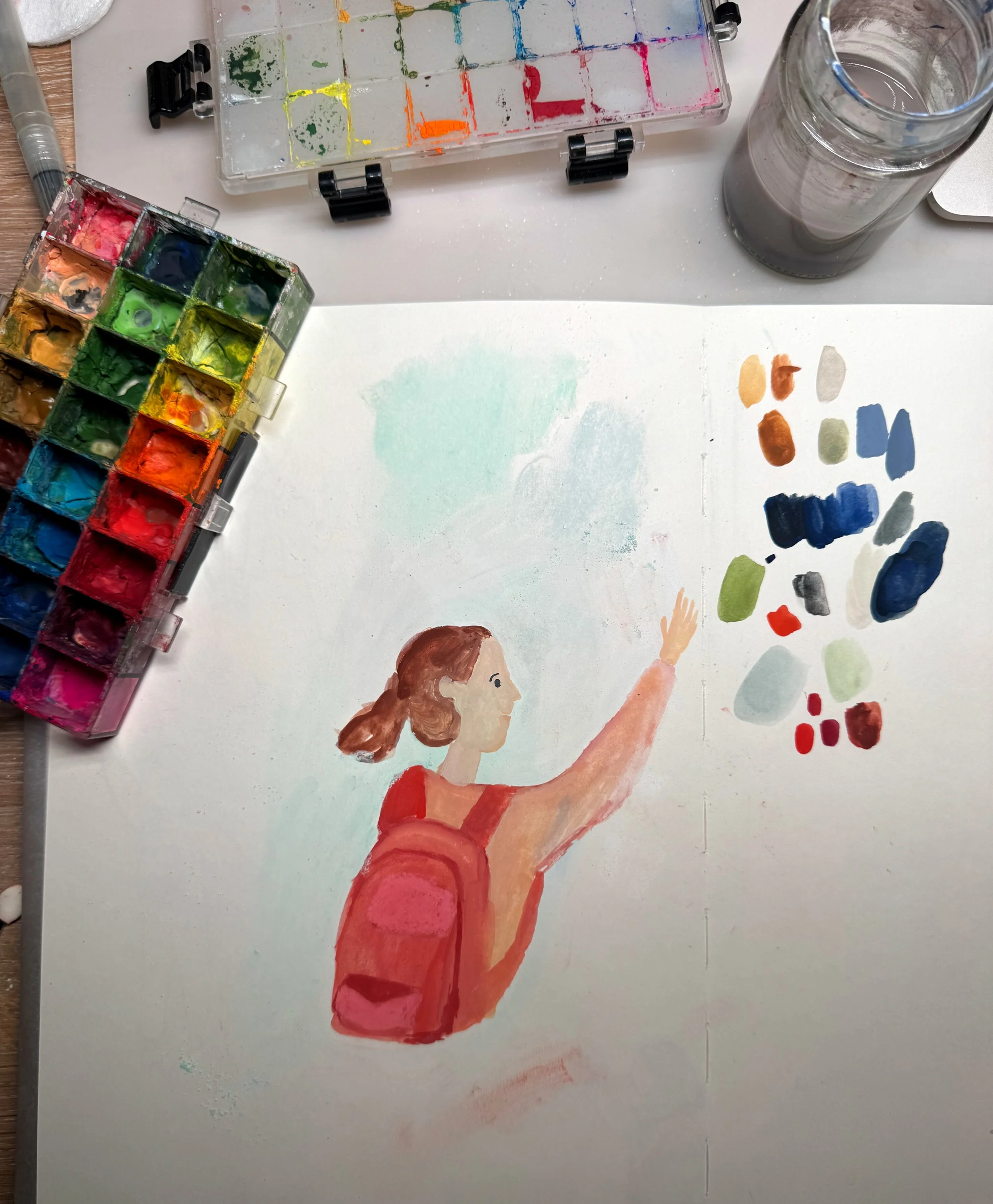
As part of the development process, I also made separate figure studies and colour tests before resolving the final composition. This allowed me to think more carefully about gesture, character and how the figure should sit within the atmosphere of the image. Exploring the palette in this way helped me shape the emotional tone of the work and refine the relationship between colour, mood and narrative.
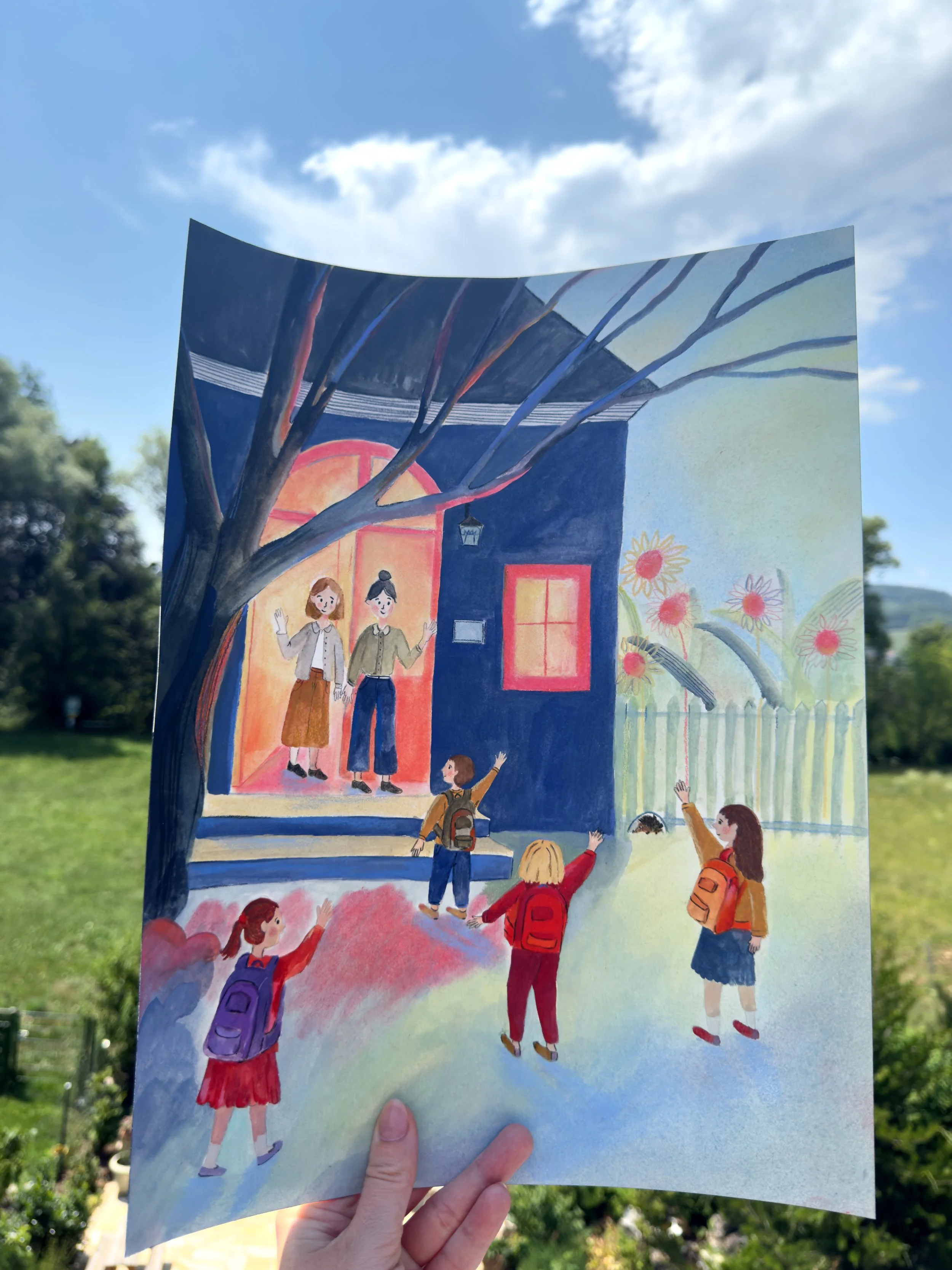
Finally, I created this image in analogue on Arches hot-pressed watercolour paper in 31 x 41 cm. It was only afterwards that I digitalised it and worked on it a little further, making small refinements while keeping the texture and atmosphere of the original handmade piece.
Landscape turned into Calendar
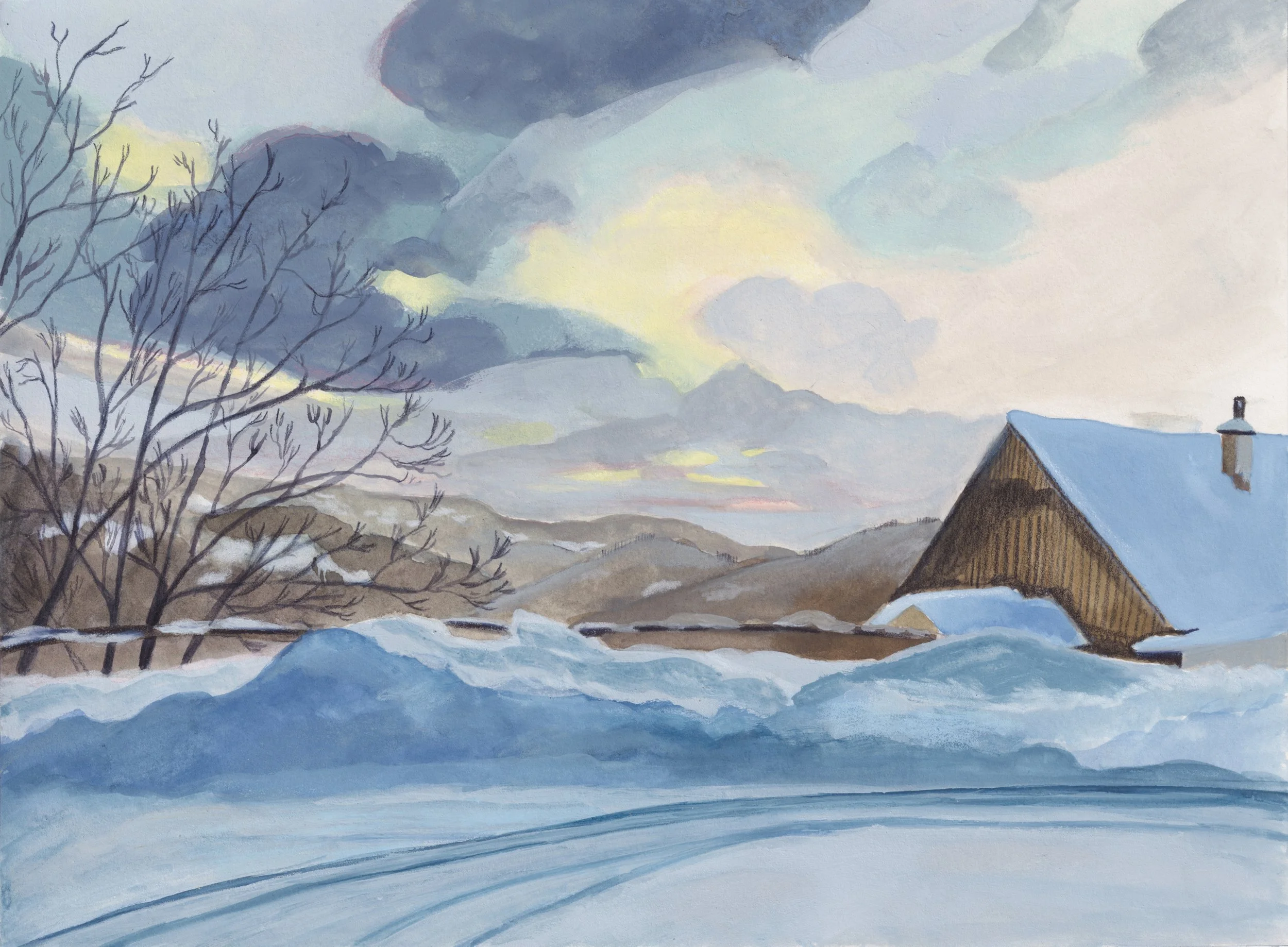
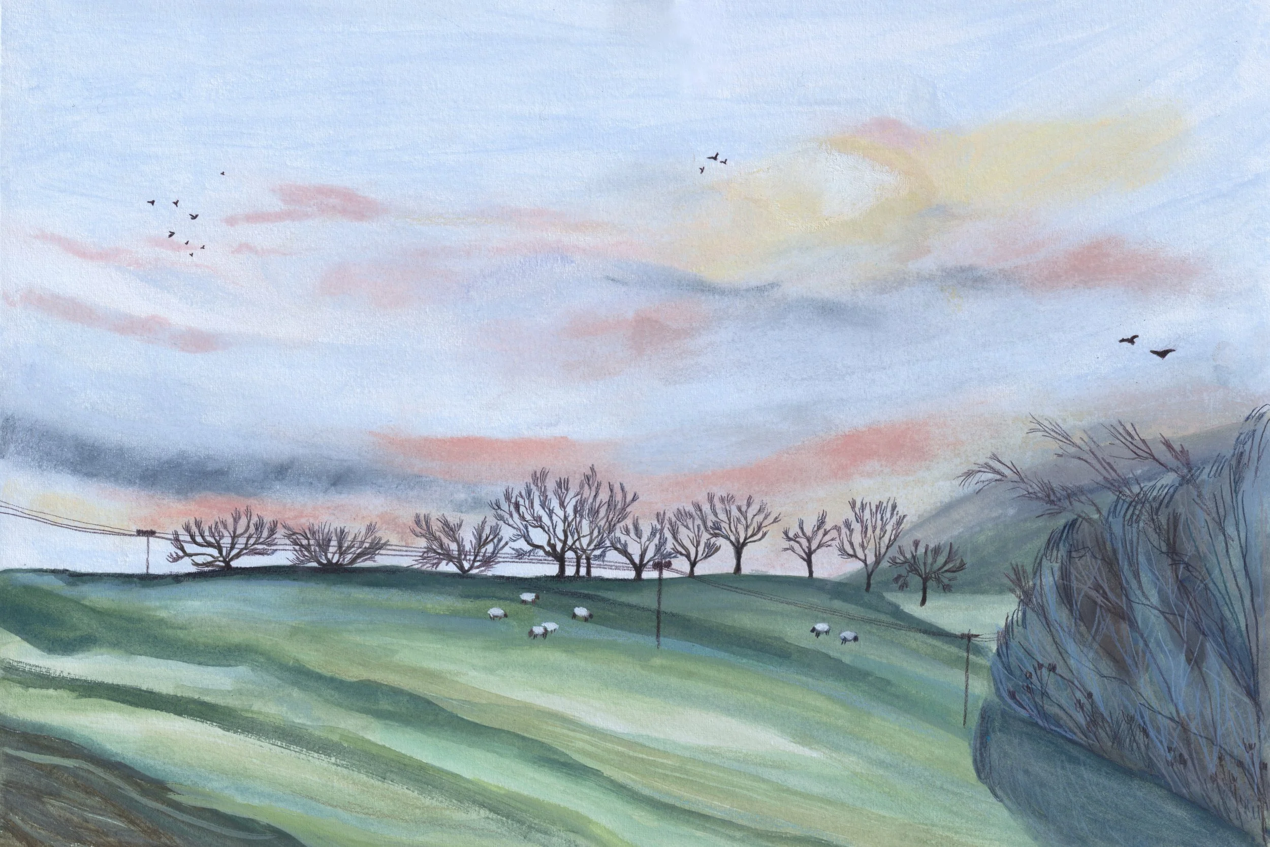
Over the last two years, I have also created calendars to sell, which allowed me to see how people respond to my work in a practical printed format. I was genuinely surprised by the interest they received, especially within my neighbourhood and surrounding area. All of the images are observational paintings based on the landscape and everyday surroundings of the place where I live. They are created as mixed-media works using gouache, pastel, watercolour, pencil and ink. This project also encouraged me to think about how individual images can belong to a wider series and accompany people through everyday life.
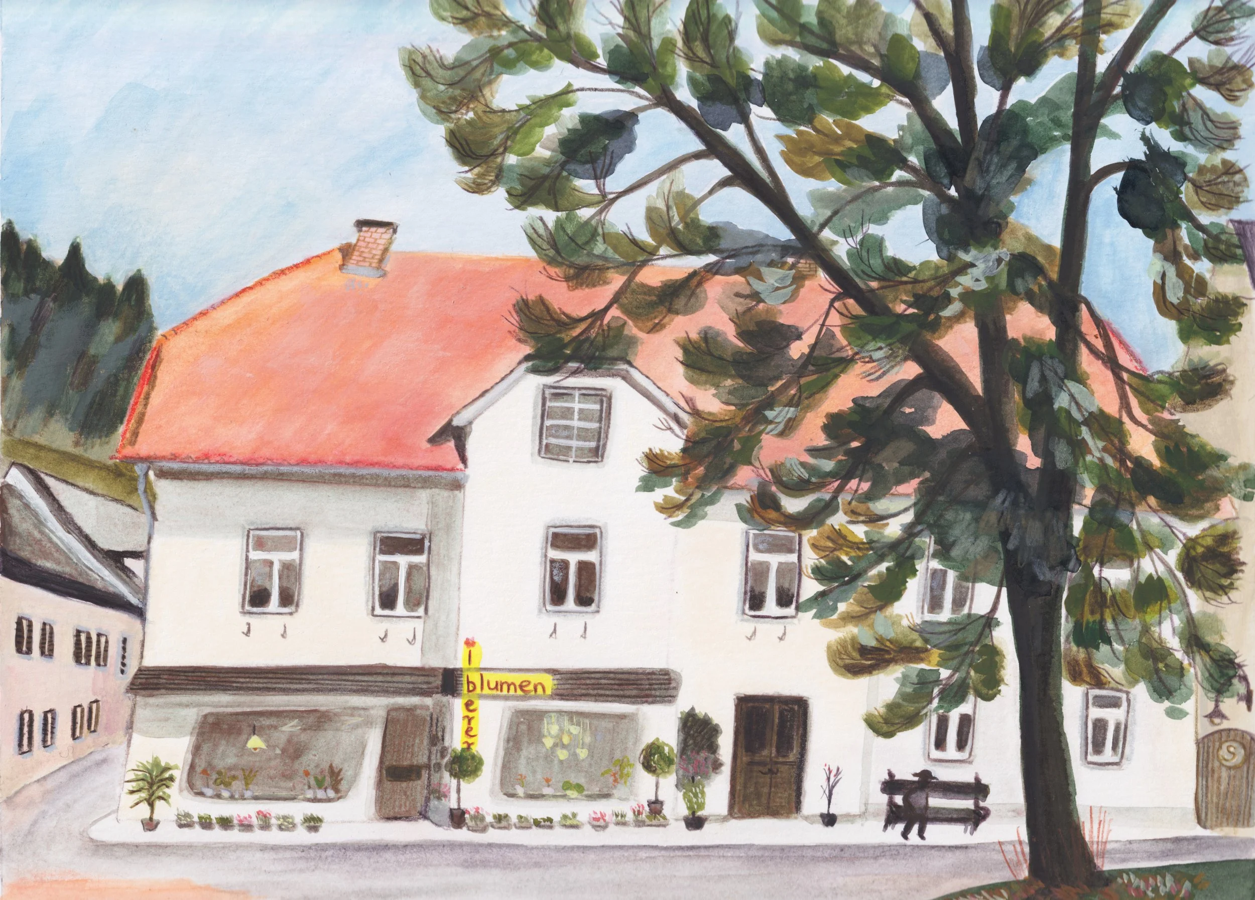
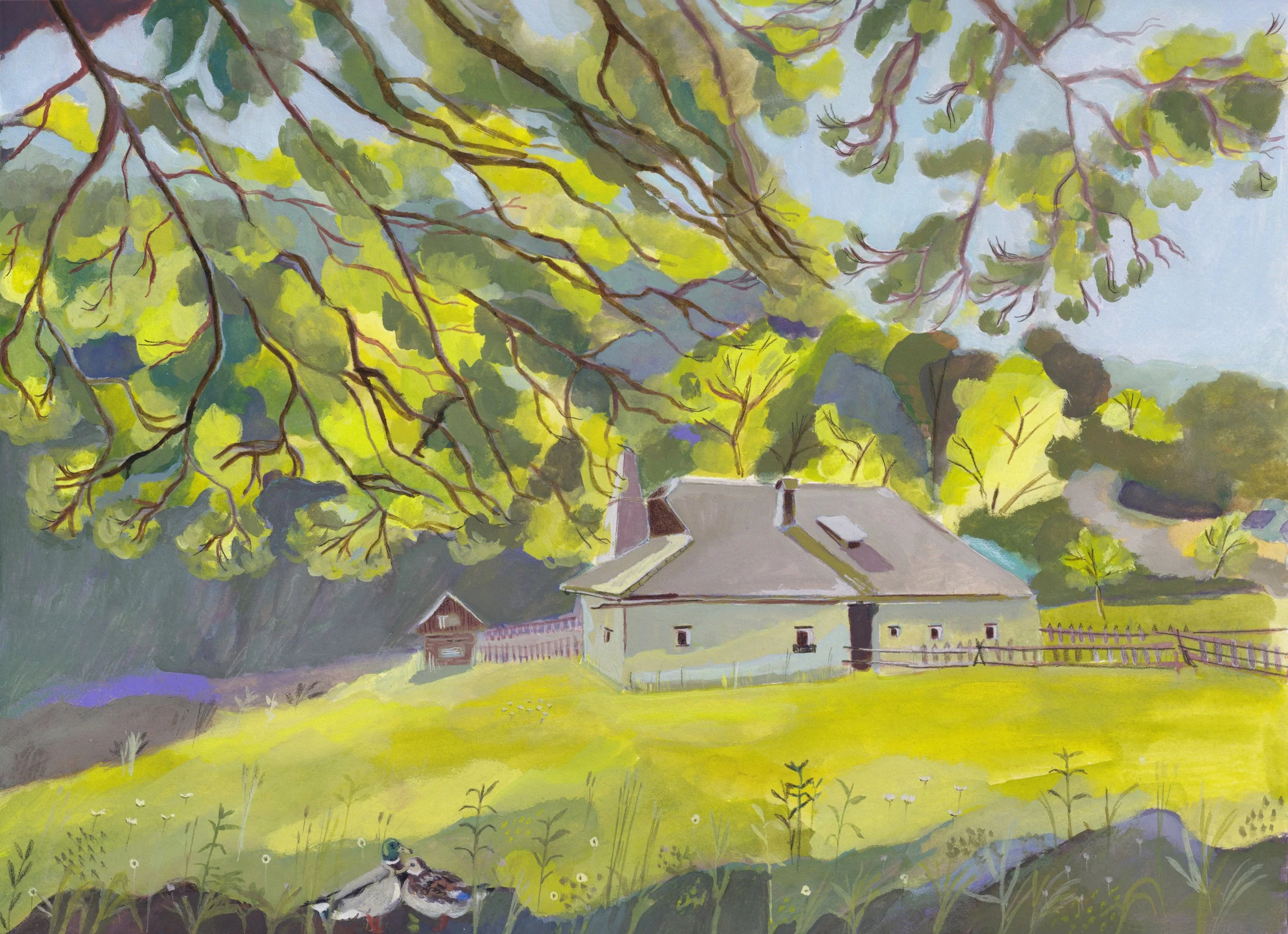


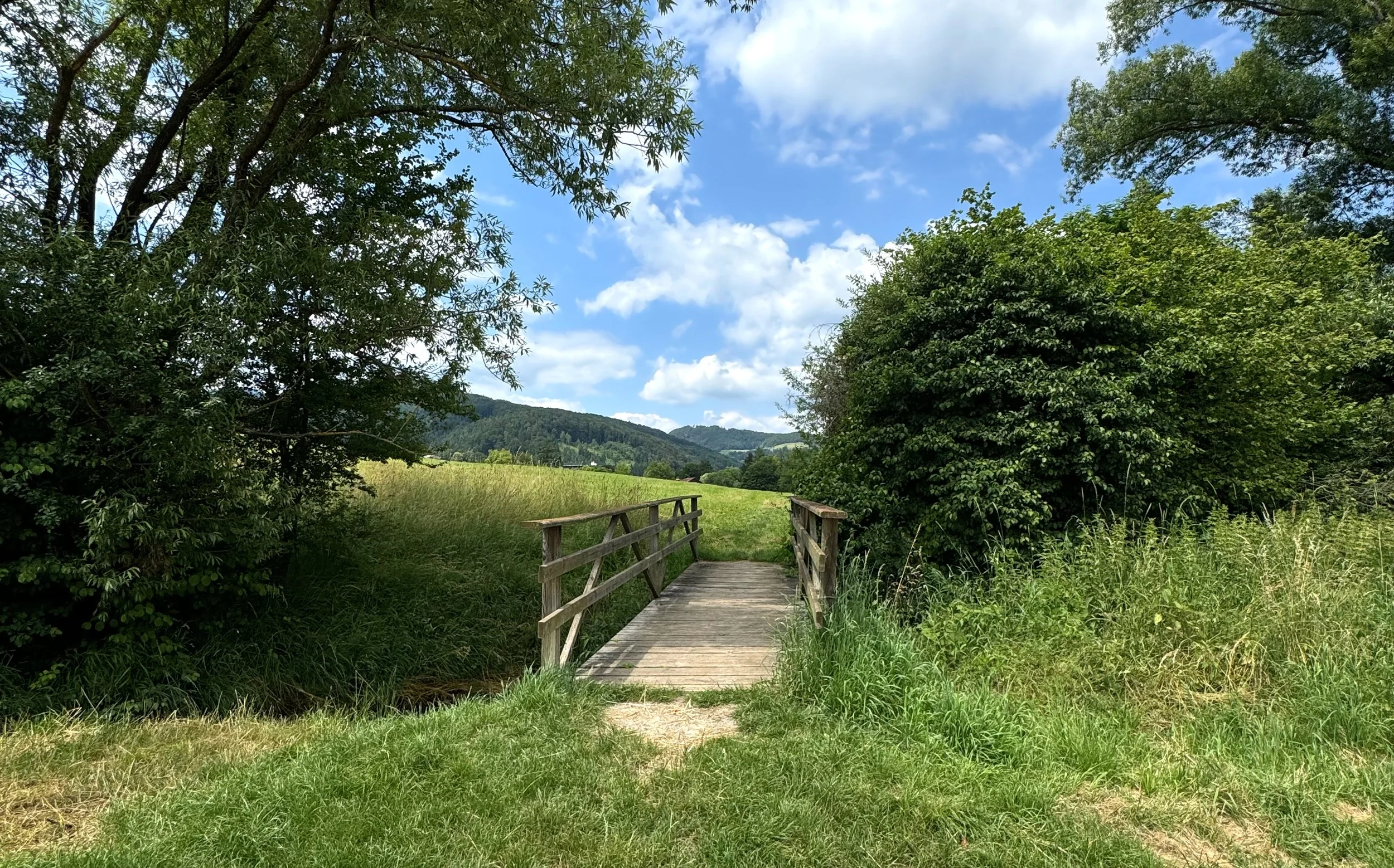
This little bridge is within walking distance of the place where I live. During maternity leave, I spent a lot of time walking in the surrounding area, and these regular walks became a quiet but important source of inspiration. Familiar places like this began to stay with me and gradually turned into subjects for drawing and painting.
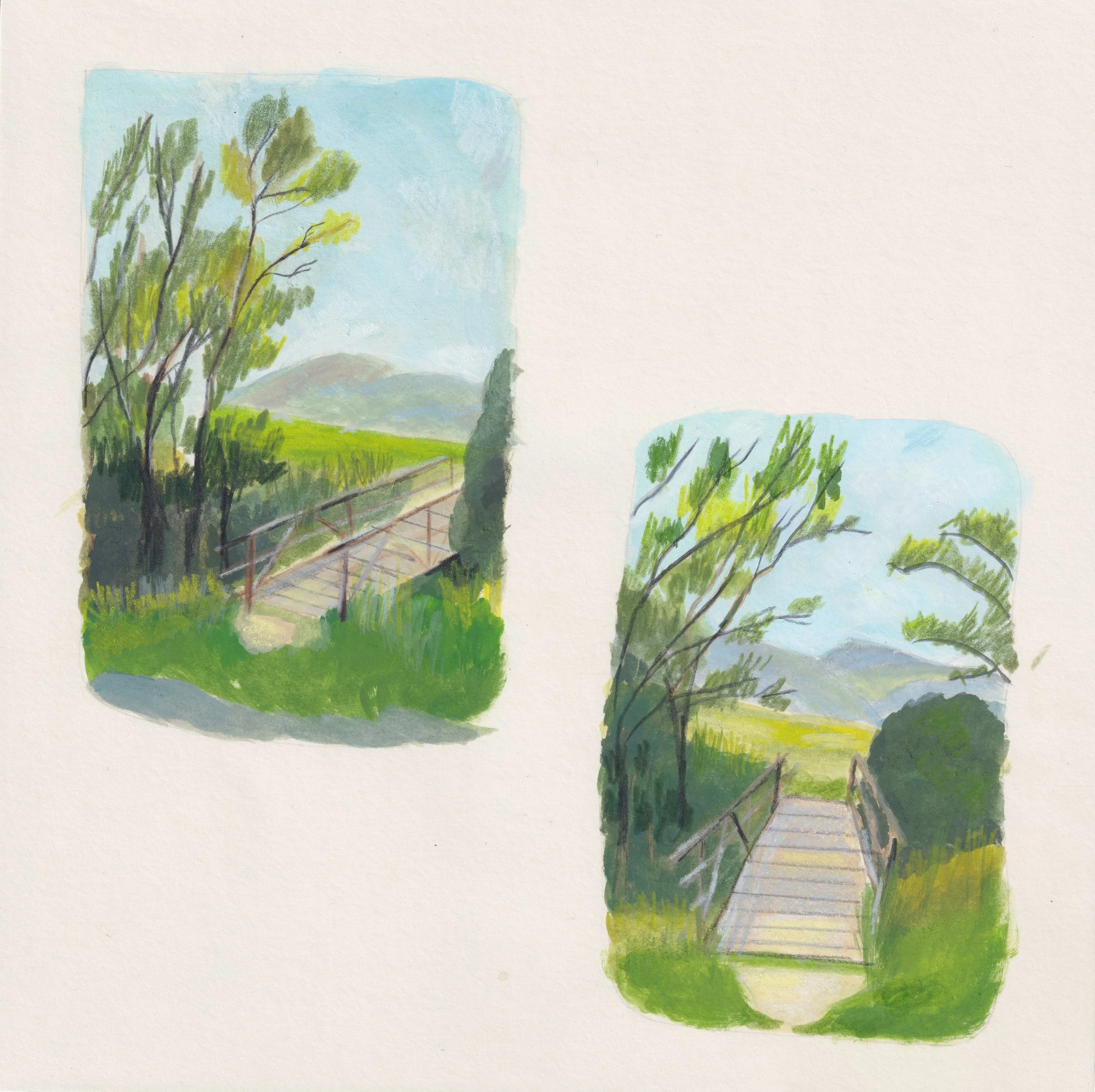
From these observations, I started to translate the scene into small illustrative studies. I was interested not only in the landscape itself, but in how it could be simplified and reshaped through colour, light and composition. These process images show how I moved from observation towards interpretation.
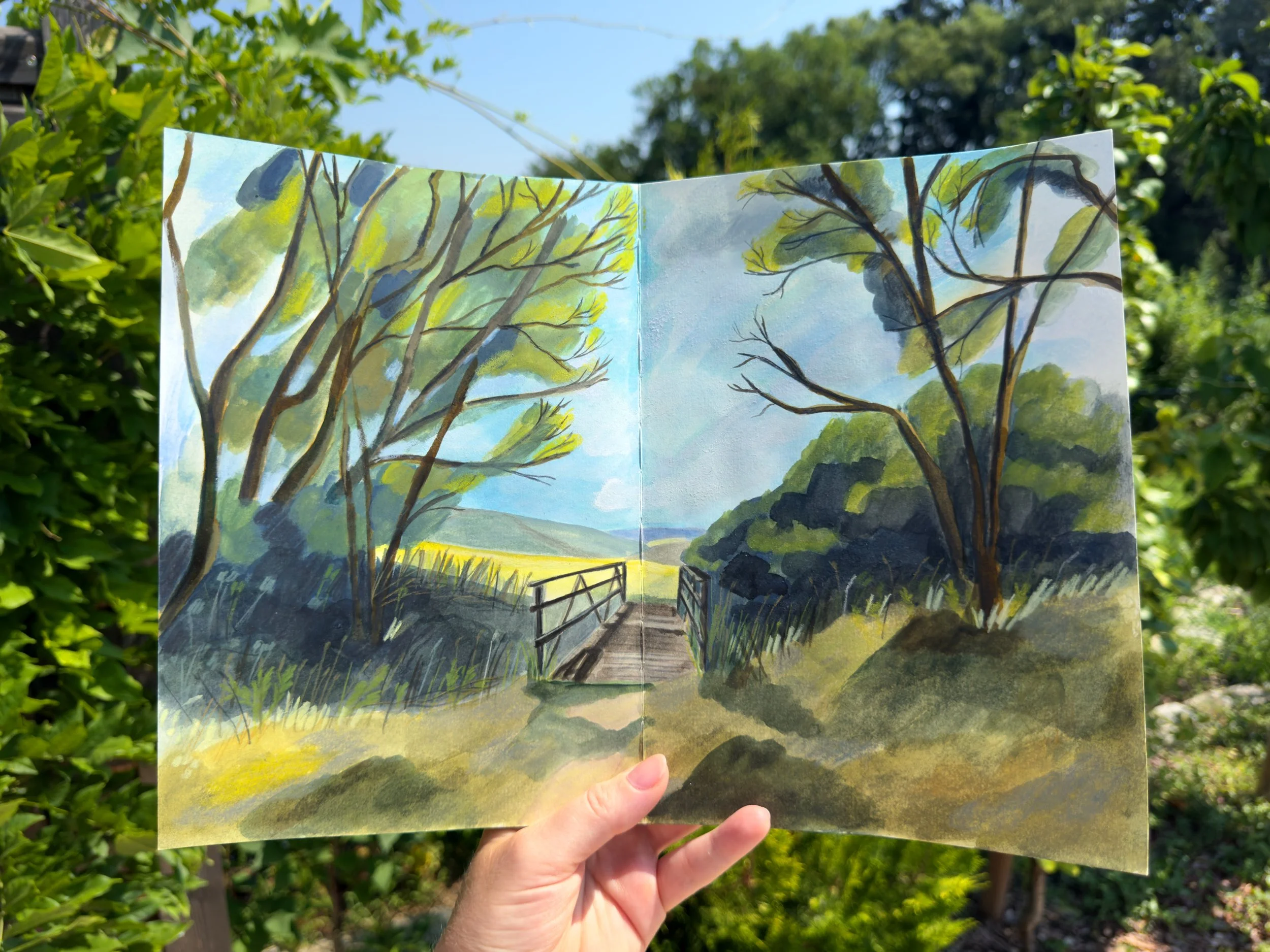
This is the final analogue image I created in my Pith Lumia Sketchbook, developed from earlier observations and small studies. Here I wanted to bring the scene into a more complete and atmospheric form. The result sits between observation and interpretation, which is an important part of how I work.
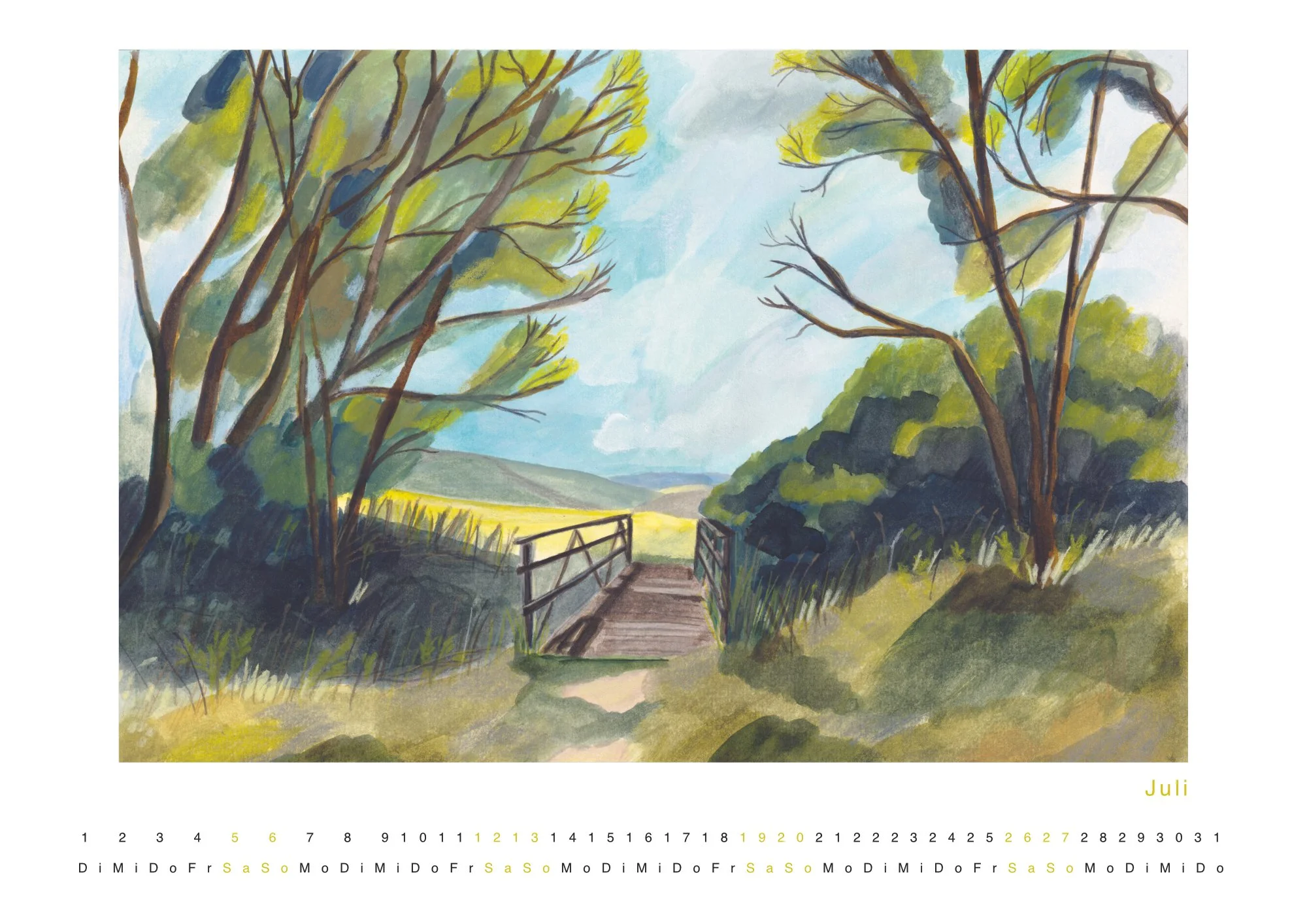
The final image later became part of a calendar project, after people encouraged me to turn these landscape illustrations into printed form. Because I had gathered scenes from different seasons, the idea of a calendar felt especially fitting. This process showed me how closely observation, illustration and everyday use can come together.
Character-Based Illustration
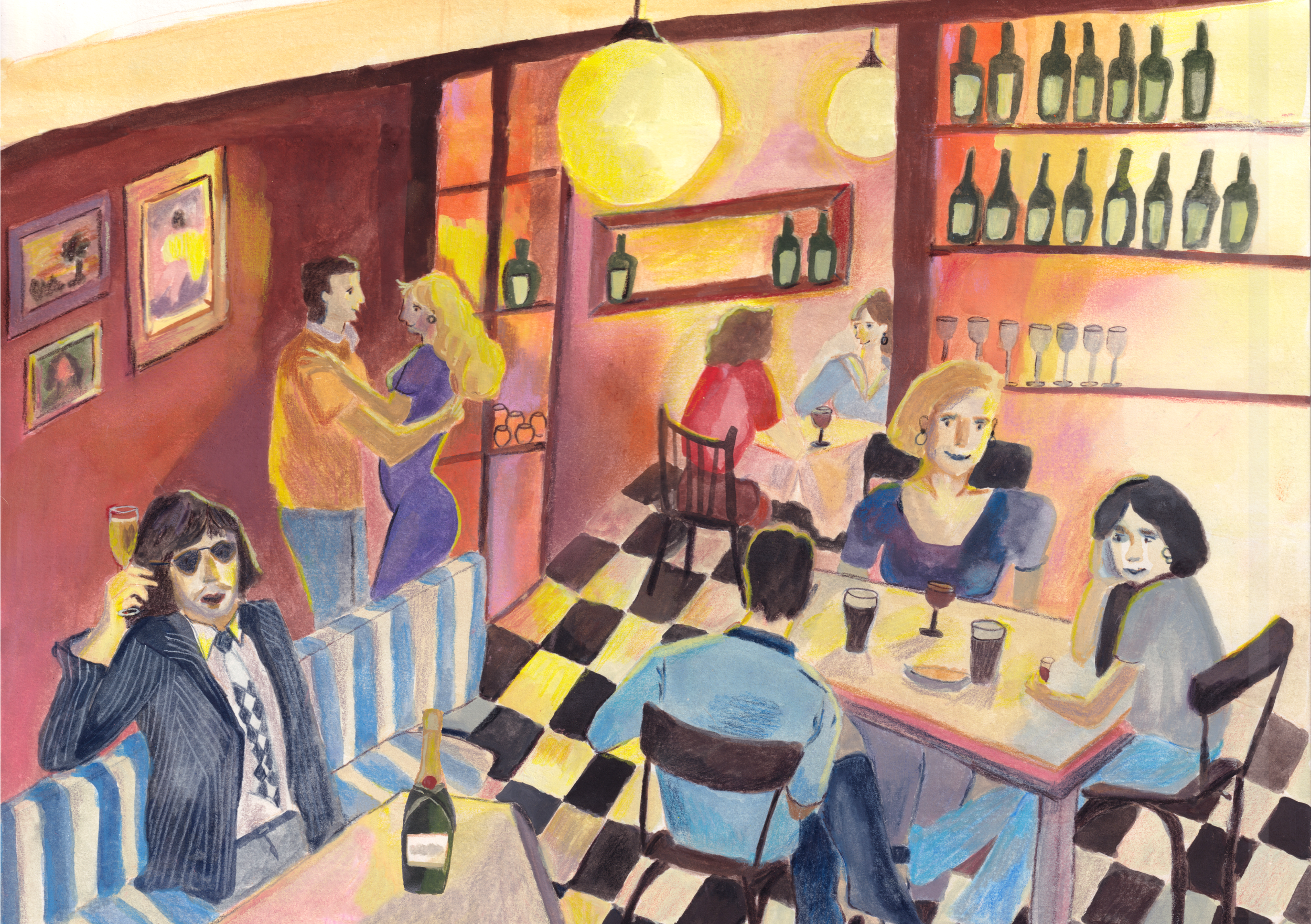
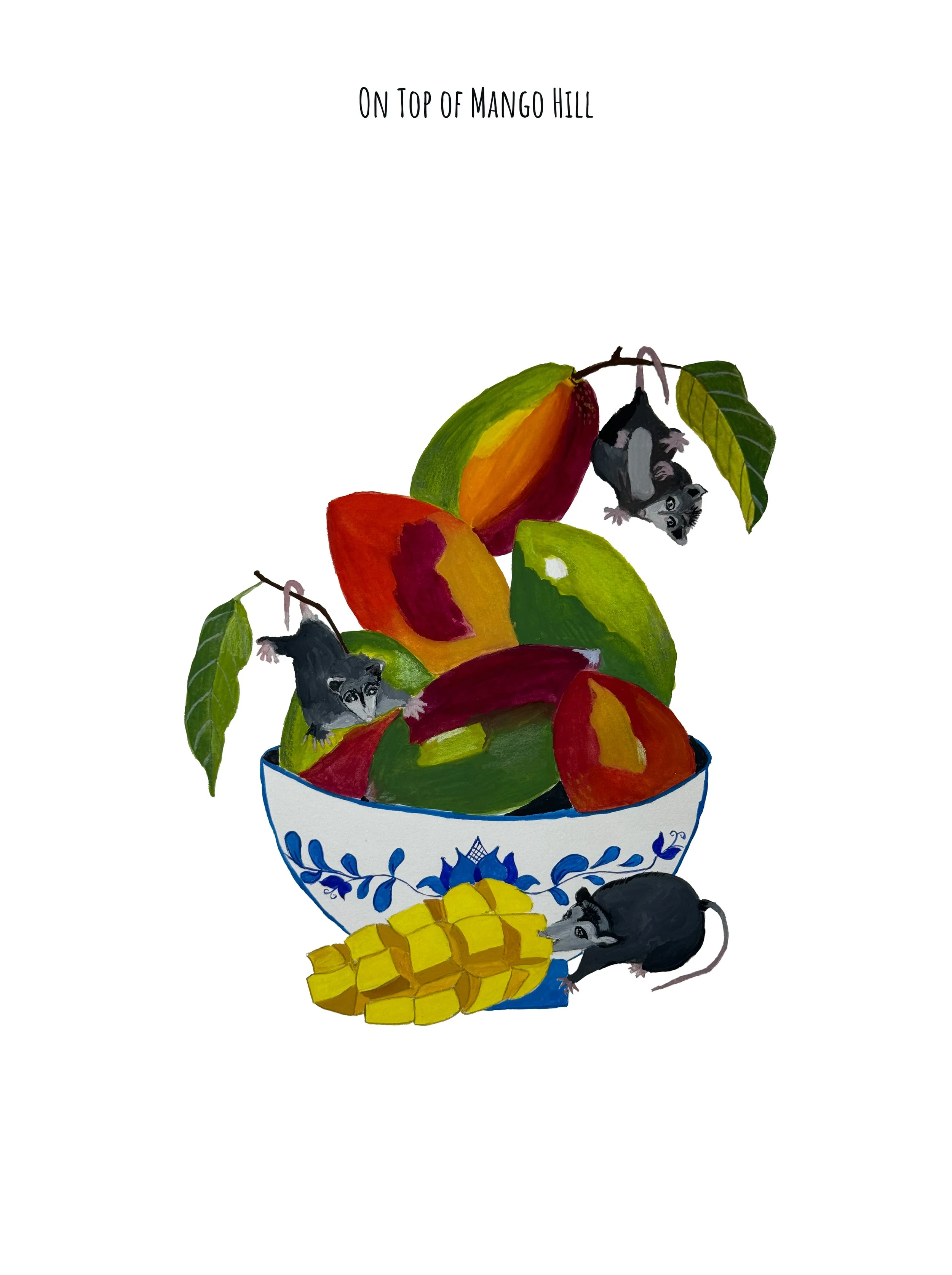
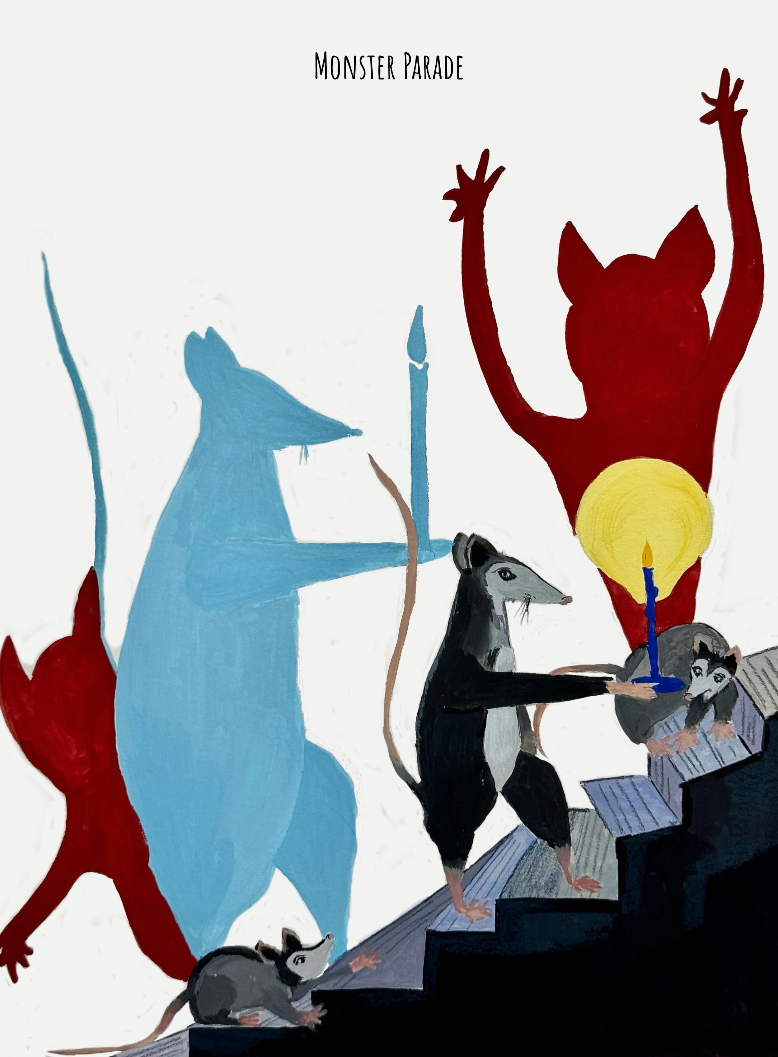
In this small series, I explored a group of recurring characters and tried to give them individuality through playful narrative settings. I was interested in how the same figures could begin to suggest a wider world when placed in different scenes, each with its own mood, tension or humour. Working in series allowed me to think not only about single illustrations, but also about consistency of character, atmosphere and storytelling across multiple images.
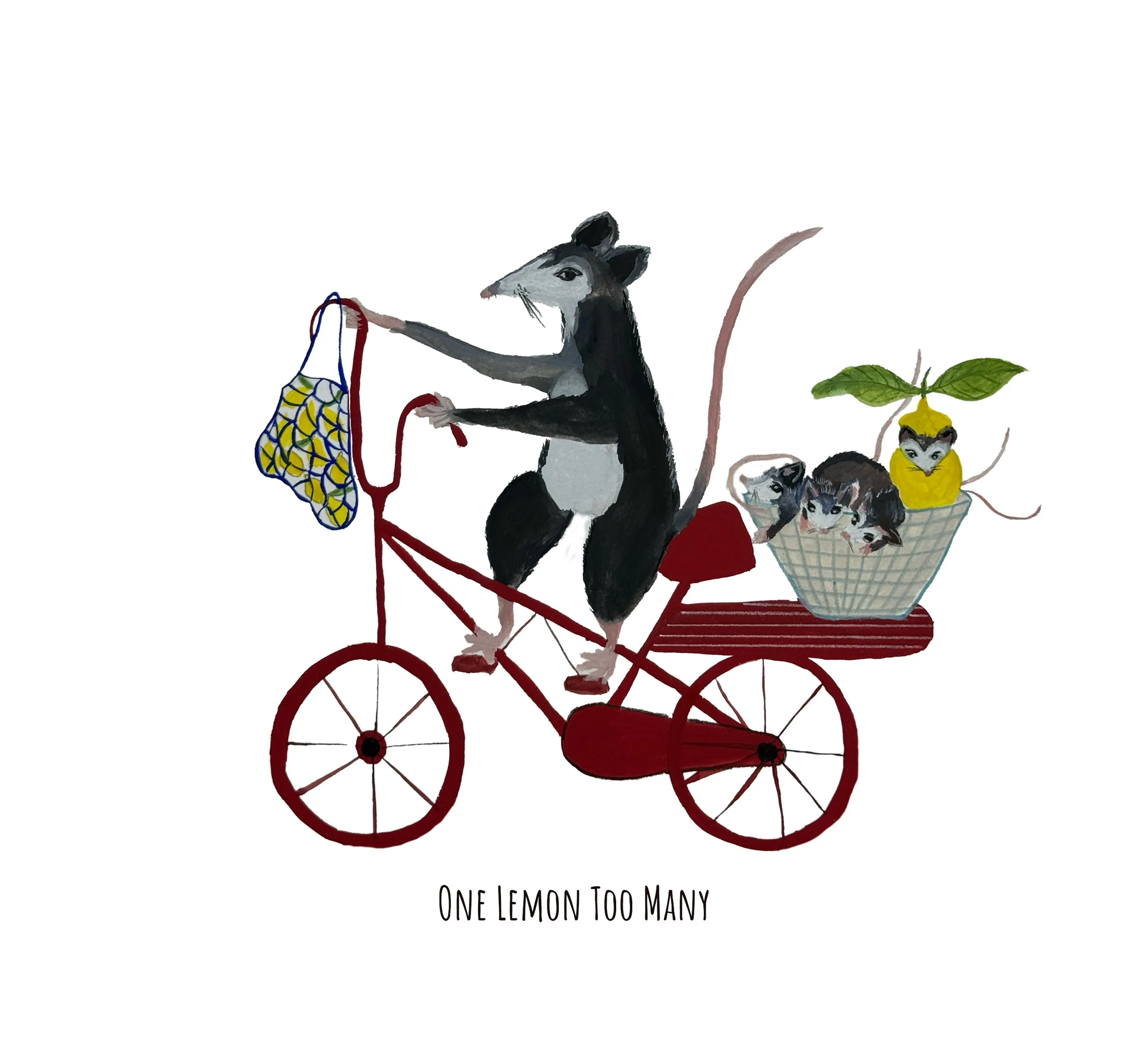
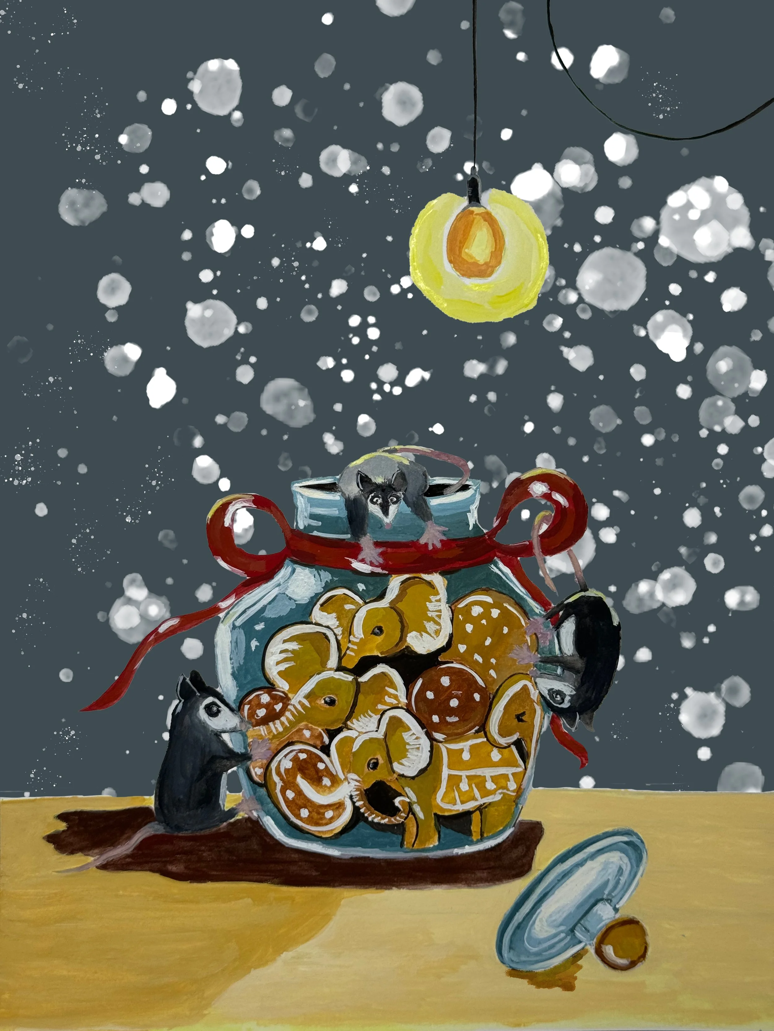
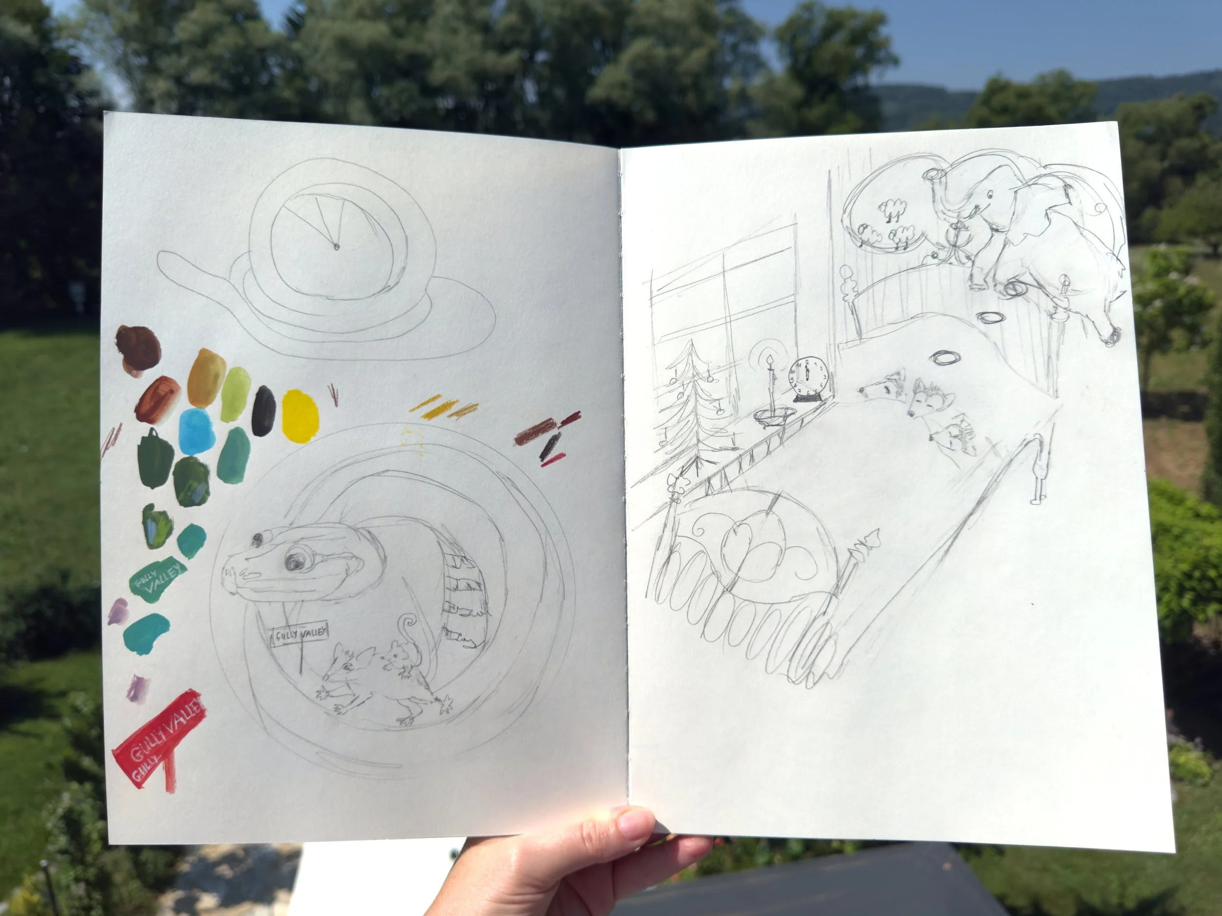
These pages show an early stage of development, where I explored characters, scene ideas, colour relationships and composition in a playful way.
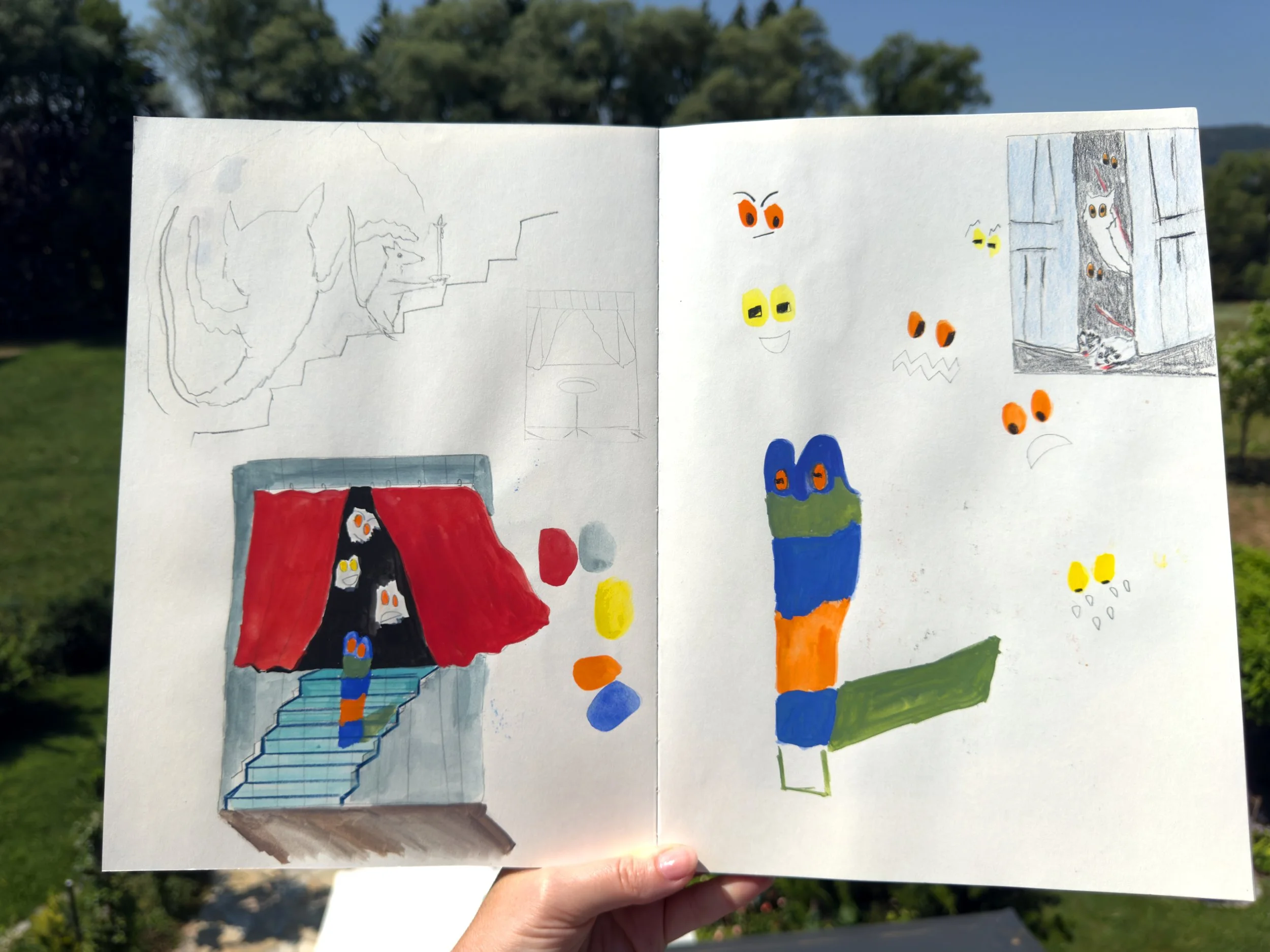
Instead of deciding everything too early, I used the sketchbook to test possibilities and let connections between figures, objects and atmosphere develop gradually.

This stage helps me think through mood, gesture and narrative, while also leaving room for surprise.
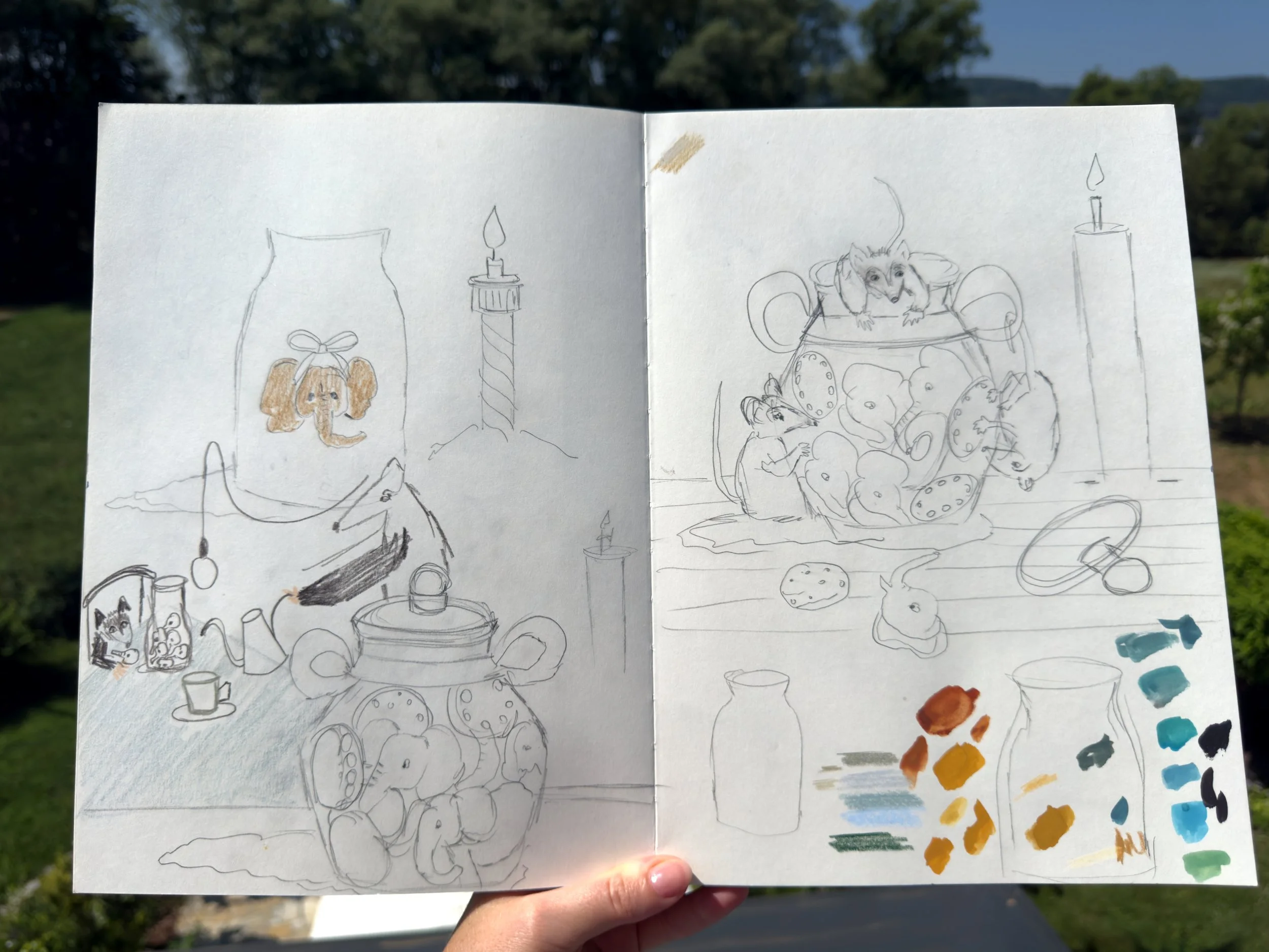
It is an important part of my process, because it allows the visual world to grow more freely before moving towards a final image.
Oil paintings
I first became deeply engaged with art through oil painting, which marked the beginning of my more serious creative practice. Working in oil introduced me to the slower, more layered process of building an image and taught me to pay attention to colour, mood and material presence. I also exhibited these paintings, and that experience of sharing my work publicly became an important part of shaping my confidence and long-term commitment to art.


Theater live drawing project
During a theatre production of “Der Tod und Heidi” (translation: The Death and Heidi) in Graz, Austria, directed by Evropi Thomopoulou, I created live drawings throughout the performance.
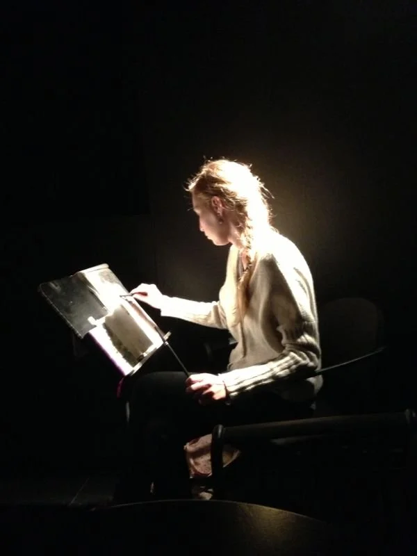
For each image, I had only a few minutes to respond before the scene shifted, so the drawings had to be made quickly, intuitively and with a strong focus on essential expression.
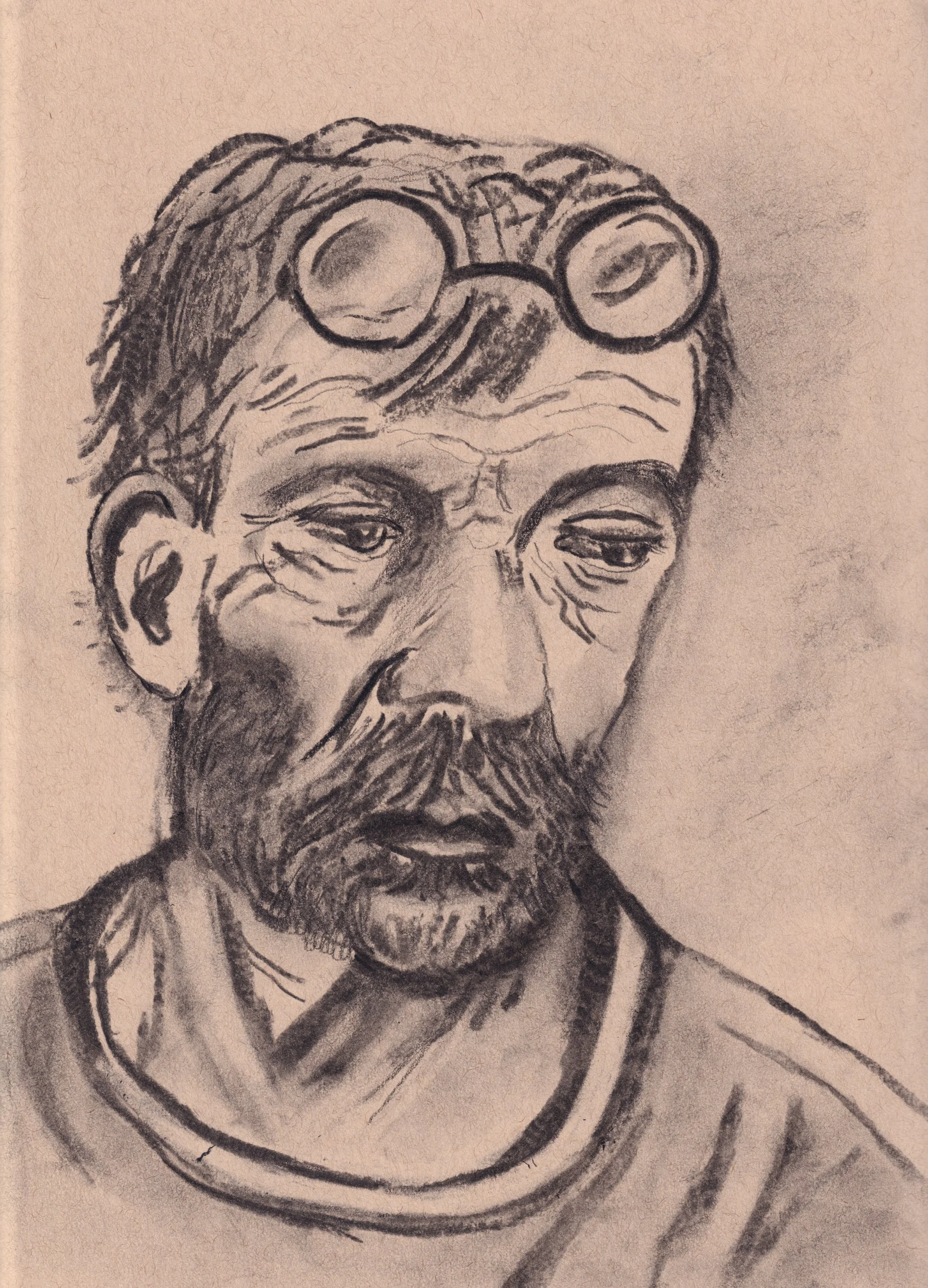
I am aware that these are not my most refined drawings, and that a portfolio should normally show work in which I feel fully confident. Even so, I have chosen to include them because, although they are early works, I remain very proud of having had this experience.
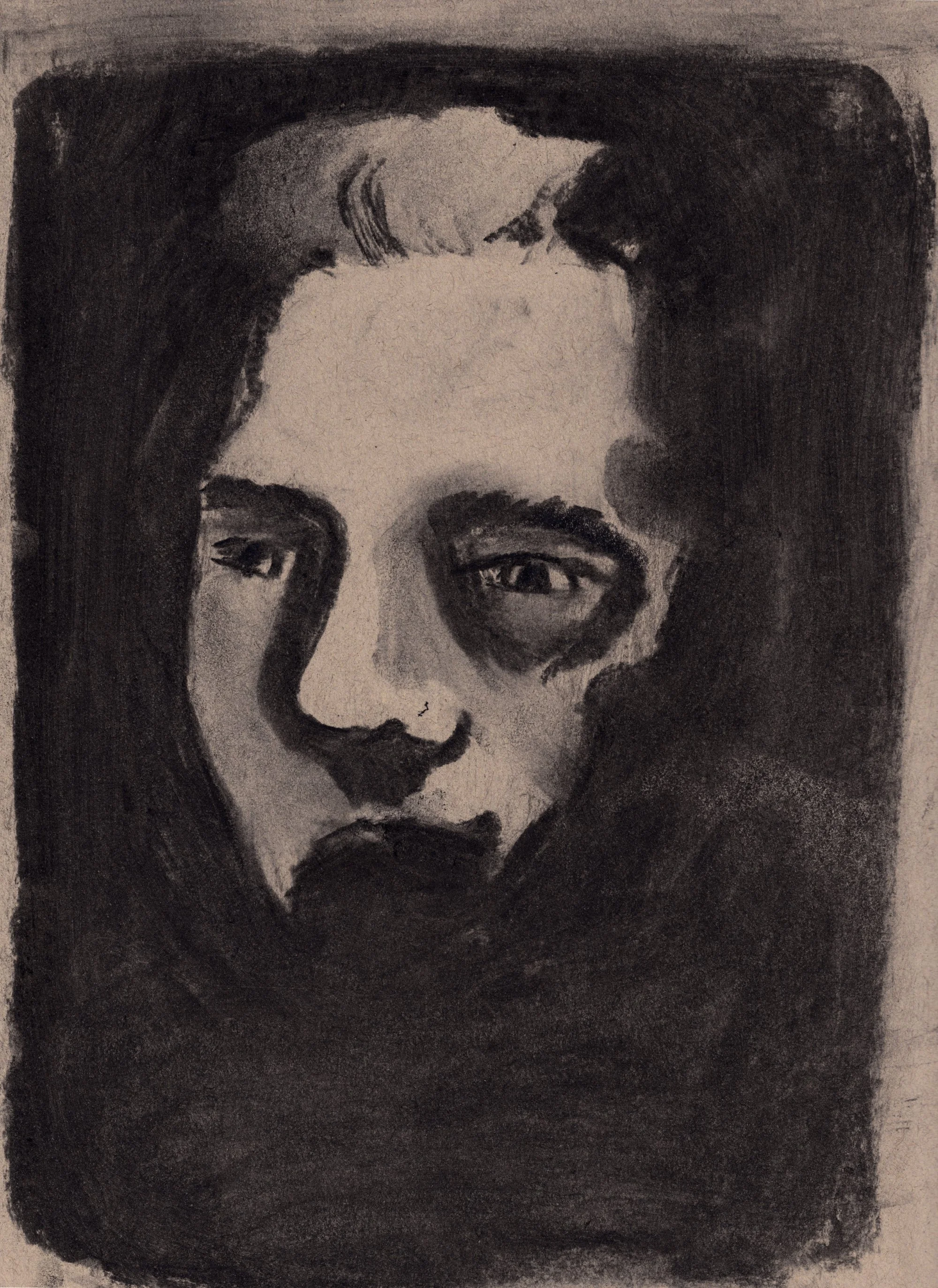
It was an important moment in shaping my love for drawing and my enthusiasm for pursuing illustration more seriously as a future path. The project reimagined the well-known Swiss fairytale through a more fragile and serious lens, touching on difficult questions around loss, life, and death.
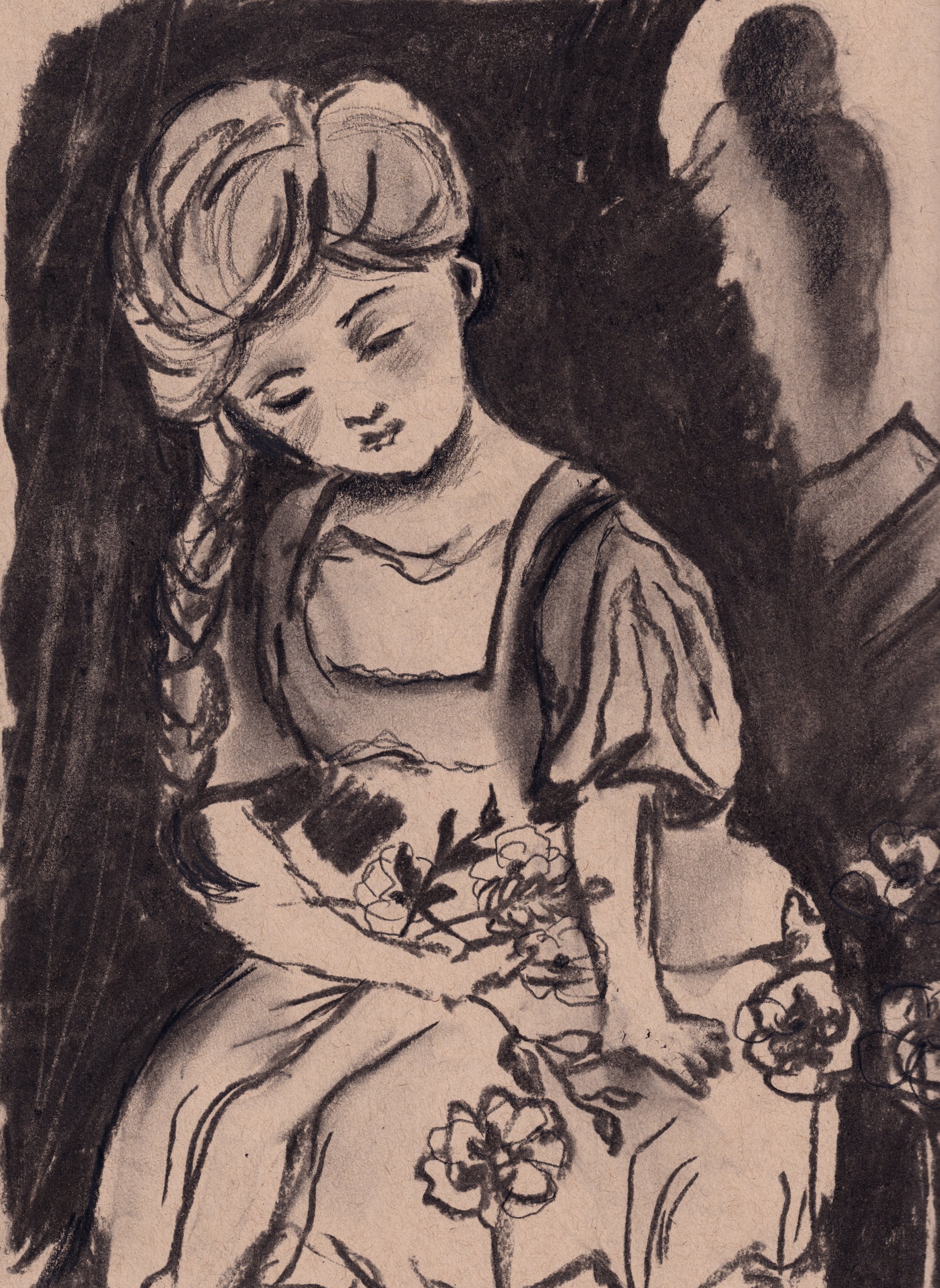
My drawings responded directly to the atmosphere on stage, capturing moments as they unfolded and becoming a visual layer of the performance itself. I used only charcoal and a little bit of Pitt Oil Base from Faber Castell for the drawings.
Thank you very much for your time and attention. I would be delighted to have the opportunity to discuss my portfolio and motivation further, and I would very much look forward to an interview with a member of your course team.
— Adrienn Zetko